Aesthetic axis · Position 2 of 4
Polished Standard aesthetic in Creative Direction
The modern SaaS visual position in the creative direction framework. Clean grids, balanced contrast, expected proportions.
Polished Standard is the visual system that gets out of the way of conversion and is hard to do well precisely because it looks ordinary.
What Polished Standard is
Polished Standard sits in the middle of the aesthetic axis. The visual system uses the conventions a modern reader has been trained to expect from a competent product company: balanced grids, generous but not editorial spacing, a moderate color palette, sans-serif body type, and a hero structure the reader does not have to learn. The work is to execute the conventions at a high enough craft level that they read as confident rather than templated.
The position is harder than it looks because the floor is so well-known. A reader has seen thousands of Polished Standard sites and can register the difference between one done with discipline and one assembled from a UI kit. The premium variant of Polished Standard invests in typography, motion timing, illustration restraint, and copy density. The lazy variant is interchangeable with every other site in the category, which is the failure mode the position has to defend against.
When Polished Standard fits
Polished Standard fits brands competing on competence in categories where the buyer needs the experience to feel safe and familiar. Insurance, telehealth, banking, fintech, B2B SaaS, consumer DTC. The buyer is unlikely to be impressed by a Maximalist visual system and is likely to be disqualified by it. The brand needs to land as a credible operator first; differentiation through the visual system is a secondary concern.
The position also fits brands whose conversion flow benefits from convention. A quote flow that uses unexpected patterns increases the cognitive load on the user and tends to lose them. A booking flow that uses the patterns the user already knows from other booking flows finishes more often. Polished Standard is the aesthetic that respects the user's pre-existing pattern library.
What Polished Standard rejects
Polished Standard rejects the visual maximalism that signals startup energy without the substance to back it. It rejects the unnecessary novelty of unconventional layouts that exist to differentiate without earning the cost in usability. It rejects the temptation to lean on illustration where photography would be more honest, or photography where structured data would serve the user better.
The position also rejects the assumption that Polished Standard is the same as bland. A premium variant of the aesthetic invests deliberately in the small distinctions that compound: type pairings that are not the default, color choices that are warmer than competitors', motion timing that breathes. The discipline is the difference between Polished Standard at craft and Polished Standard at template.
Examples in the showcase
9 archetypes that demonstrate Polished Standard
Polished Standard is the most-used aesthetic in the broader software industry, but the showcase concentrates on archetypes where the position is executed with enough craft to differentiate inside the convention.
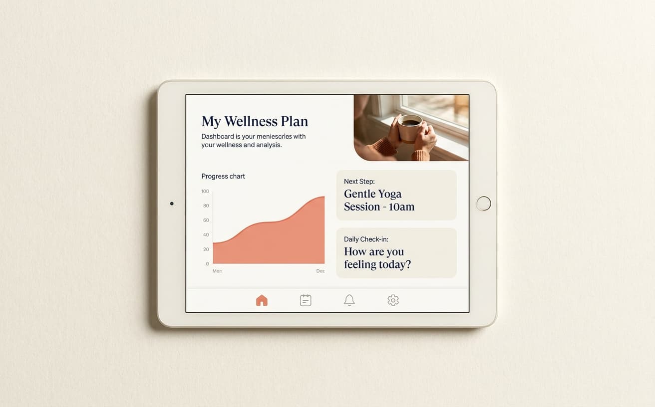
Carepath
TelehealthCarepath is care plan dashboard preview, three-step flow, soft coral on off-white. The Polished Standard aesthetic gives the platform the procedural credibility healthcare requires while the Conversational tone differentiates inside the convention.
See the archetype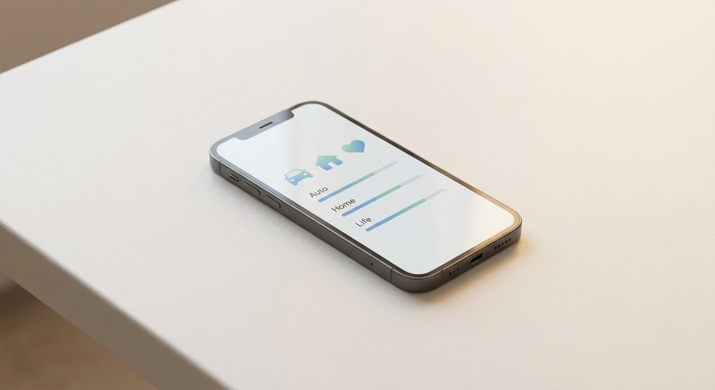
Cover
Direct-to-consumer insuranceCover is phone-mockup hero, three coverage cards, four-step how-it-works, transparent pricing with the math shown. Polished Standard is the aesthetic that allows the brand to strip insurance friction without losing the trust the category requires.
See the archetype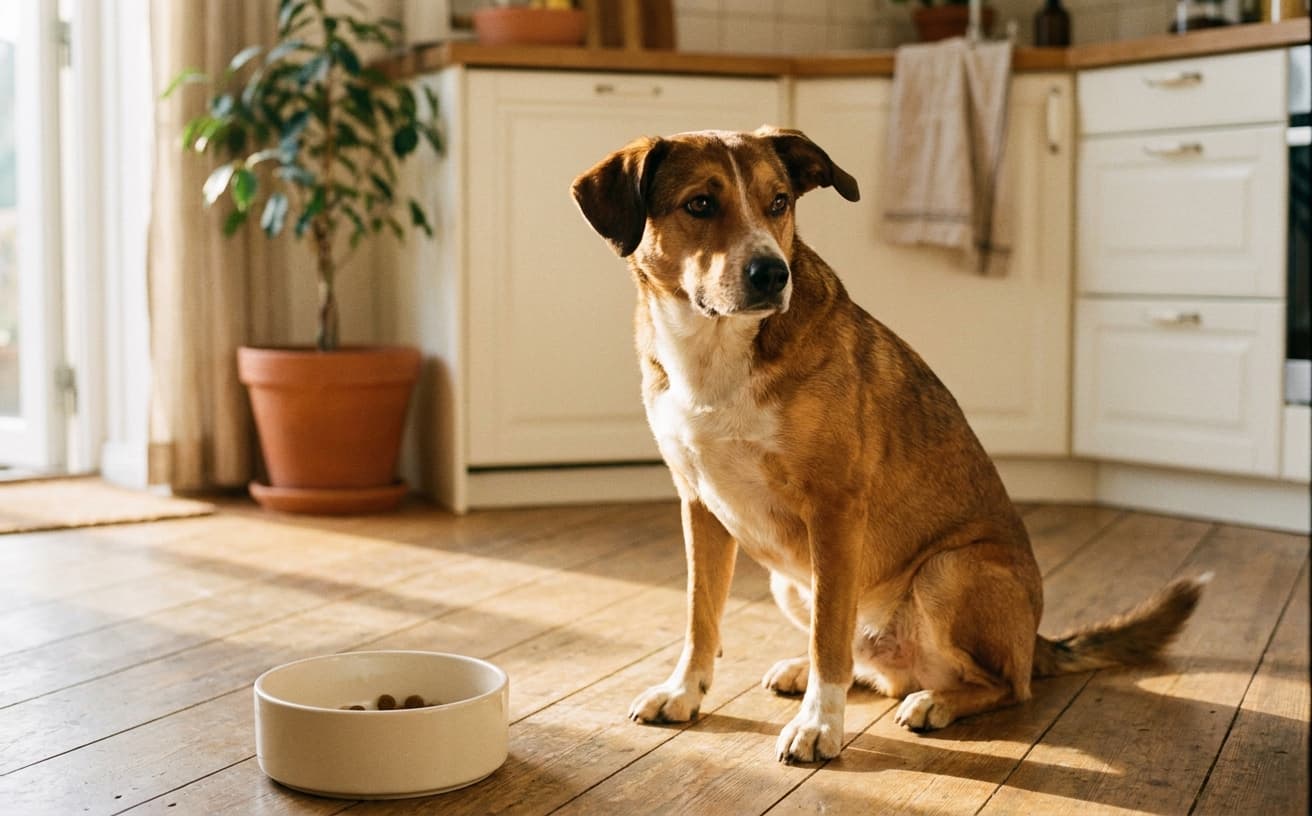
Hounder
DTC dog foodHounder is warm DTC pet brand. Dog-as-family voice, transparent ingredients. Polished Standard with affection: the category convention executed with enough warmth to differentiate from the institutional pet-food register.
See the archetype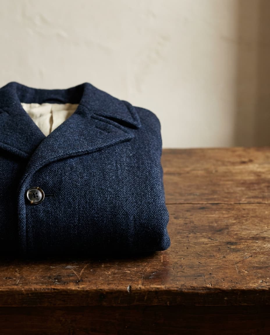
Common Hand
Heritage menswearCommon Hand is heritage menswear at the modern web register. Maker provenance, fabric biography, typography that respects the discipline. Polished Standard is what lets the heritage cues read as contemporary craft rather than period costume.
See the archetype
Hexa
AI developer toolHexa is AI dev tool with personality. Animated gradient mesh hero, dark mode primary, monospace and serif hybrid. Polished Standard with motion-rich texture; the position holds the procedural credibility while the texture differentiates.
See the archetype
Beacon
Self-custody crypto walletBeacon is crypto wallet with personality. UI mockups showing portfolio, peer-not-evangelist voice. Polished Standard is the move that differentiates from the maximalist crypto-marketing register.
See the archetype
Pacer
Performance running apparelPacer is performance running with kinetic typography and athlete-driven photography. Polished Standard is the floor the kinetic moves are built on; the convention is the canvas, not the constraint.
See the archetype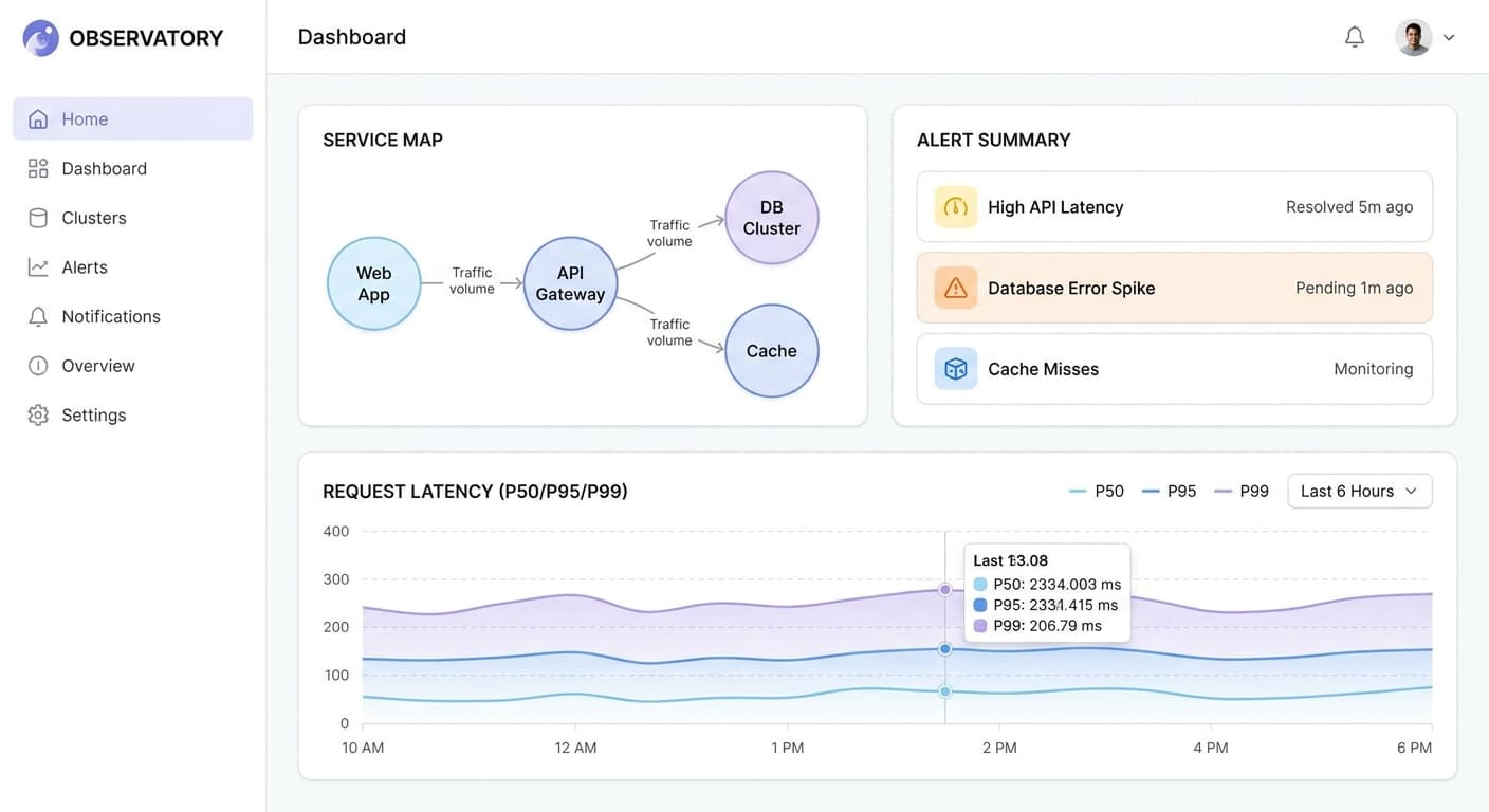
Observatory Standard
Observatory Standard is the canonical reference for the position inside the framework. Polished, balanced, expected. The point of the archetype is that the category baseline executed at high craft is itself a position.
See the archetype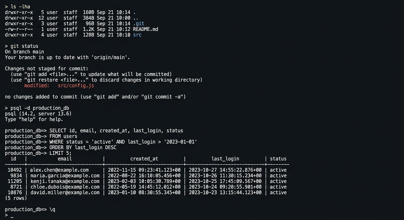
Observatory Workshop
Workshop is Polished Standard with developer-tool voice. Dark terminal mockup as hero, syntax-highlighted commands. The position holds the convention the category expects while the Playful tone differentiates.
See the archetype
How Polished Standard composes with the other axes
Polished Standard pairs most often with Conversational tone (Carepath, Cover, Hounder, Hexa, Beacon) and with Considered sensory. The combination is the modern B2C and B2B-SaaS register that defines the most populated quadrant of the framework. Polished Standard with Functional sensory produces the dev-tool variant (Workshop, Observatory Standard).
Polished Standard with Provocative tone is rare and produces work where the aesthetic floor permits the voice to land more sharply (Pacer, Anode-adjacent moves). Polished Standard with Playful tone is the Glo / Curve adjacent register when the texture leans Maximalist instead.
Failure patterns
How Polished Standard fails
Concrete patterns to watch for when adopting the position. These are the failure modes the position has to guard against, in order of how often they appear in the wild.
Failure pattern 1
Looking like every other SaaS site
The dominant failure of Polished Standard is interchangeability. A brand that adopts the convention without investing in the small distinctions reads as one of dozens of similar brands the buyer has already evaluated. The fix is not to abandon the convention; it is to invest deliberately in the typographic, motion, and illustration choices the convention permits.
Failure pattern 2
Mistaking Polished Standard for permission to be generic
Brands that arrive at the position because it feels safe miss that the position rewards craft visible only at the edges. The conventional layout still has to be composed; the conventional palette still has to be calibrated. Generic Polished Standard reads worse than a Maximalist site at the same craft level.
Failure pattern 3
Templating the brand into the category convention
Polished Standard does not require the brand to lose its voice. Brands that adopt the visual convention but also adopt the category's verbal convention produce work that is fully interchangeable. The discipline is to use the aesthetic as the floor and let the tone differentiate.
Failure pattern 4
Refusing to invest because the budget feels invisible
Polished Standard's spend is hidden inside the small choices, which makes it harder to justify than a Maximalist treatment that visibly demonstrates the budget. Brands that under-invest in the position produce work that looks like the budget did not exist; brands that invest produce work that competitors cannot replicate without the same investment.
References