Framework · Axis 2 of 4
Aesthetic in creative direction.
How much visual density does the work carry? How much does each element earn its place?
The aesthetic axis sets the visual register that every downstream design decision answers to. The position picked here propagates into typography choices, color palette size, grid density, photography direction, motion principles, and the question of whether the page should breathe or should fill.
The question
What does this axis answer?
Aesthetic answers a question of density. How much does each element have to earn its place on the page? In a Restrained system, every element earns. In an Expressive Maximalist system, the page earns by maintaining coherence under abundance. The two ends of the spectrum solve opposite strategic problems. Restrained earns attention by deserving it. Maximalist captures attention by not letting it leave.
The right position depends on the category and the audience. Categories where the audience is over-marketed reward restraint; restraint reads as confidence in a world that smells like a hard sell. Categories where the audience is under-engaged reward maximalist energy; density reads as conviction in a world that smells like committee compromise. The wrong choice for the context produces work that fails on its own terms even when the execution is clean.
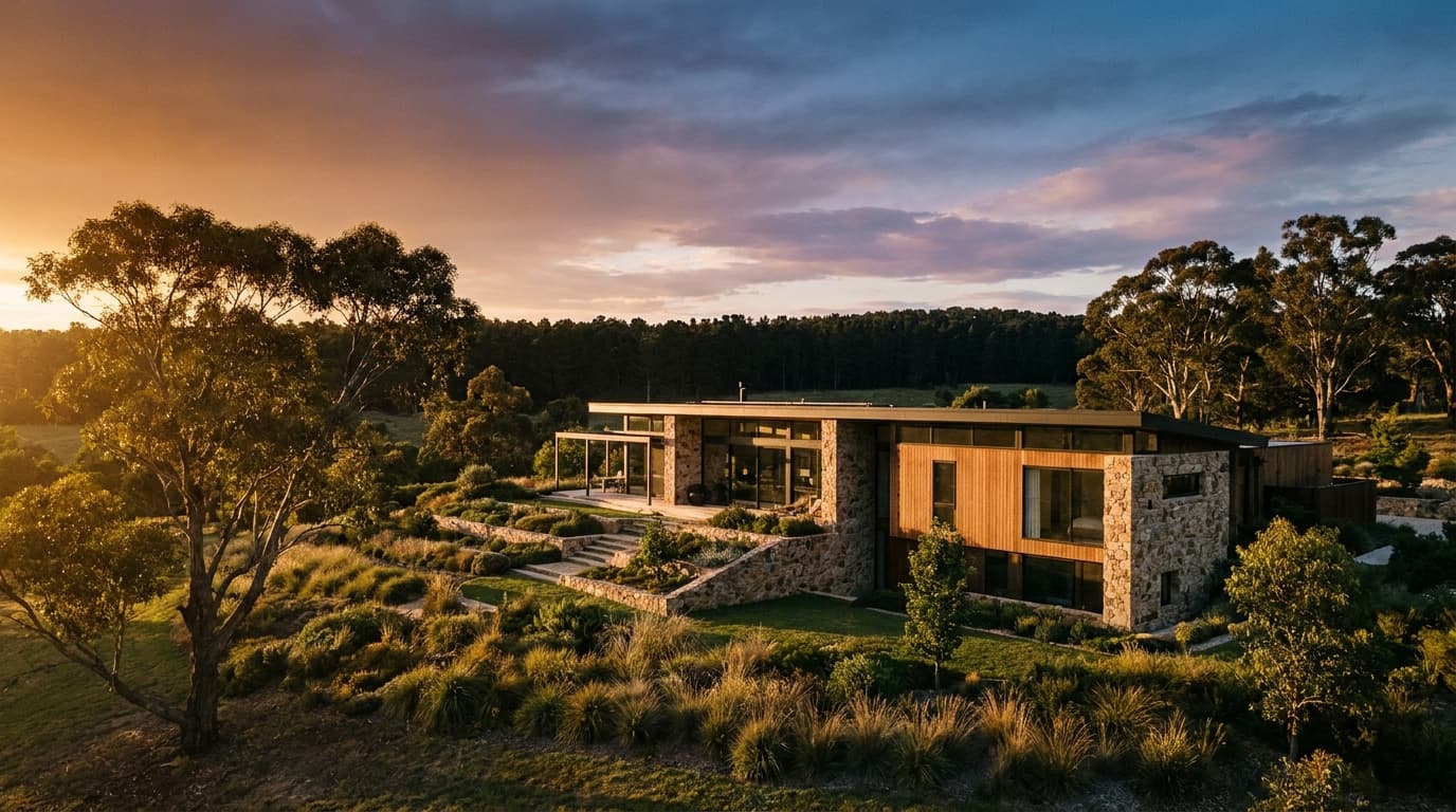
Editorial Restrained.
Generous white space. Single definitive image instead of grids. Considered typography. Low color count. The Restrained system asks the reader to slow down and rewards them with the work the page asked them to do. Aesop sits here. Pentagram print sits here. The Economist editorial design sits here.
When it fits: premium positioning, considered purchase decisions, audiences that are over-marketed and reward the absence of selling, brands whose positioning is “we have nothing to prove.”
What it rejects: density-as-content, three-icon feature rows, the assumption that more elements signal more value. Restrained brands trust the reader to bring patience.

Polished Standard.
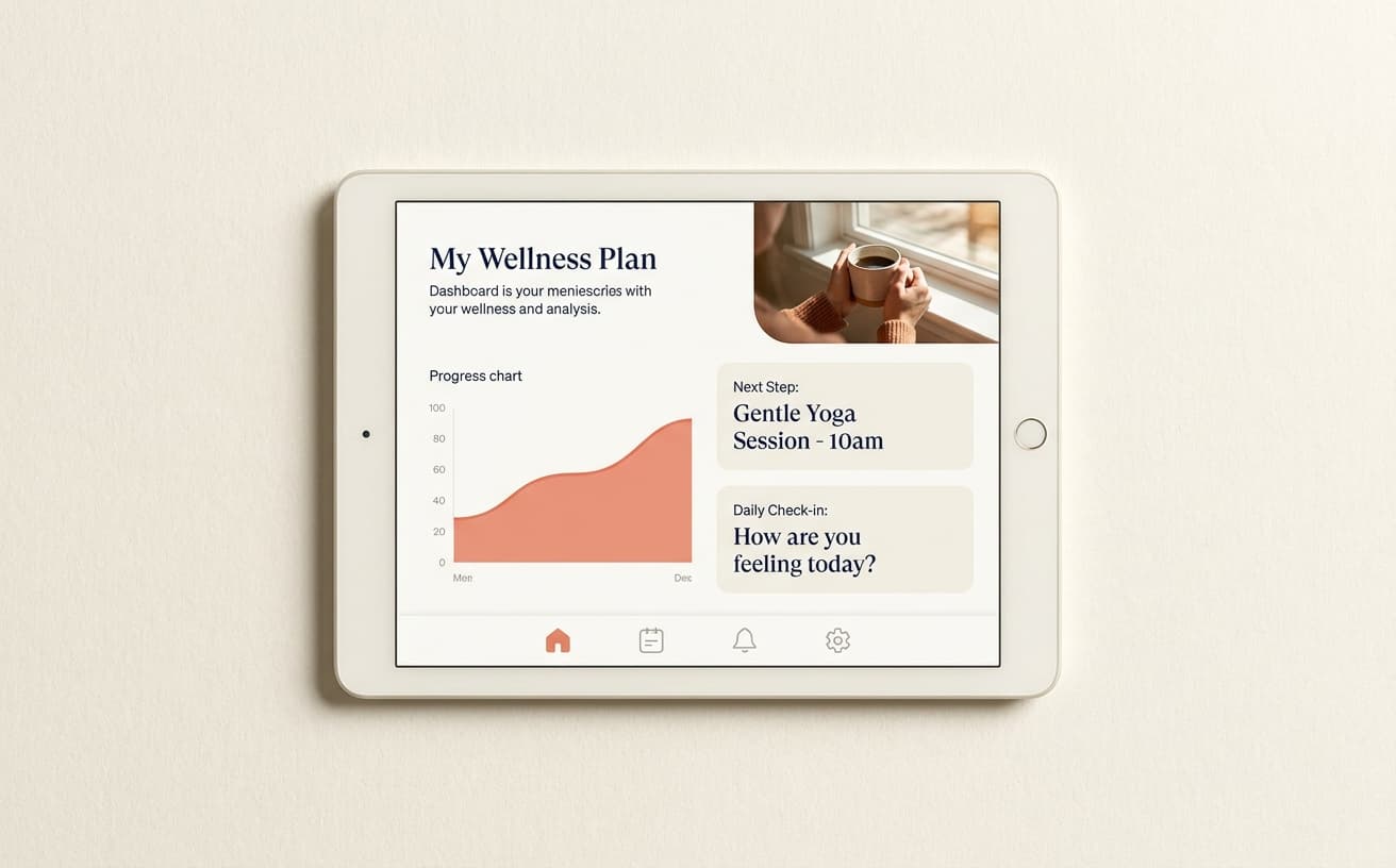
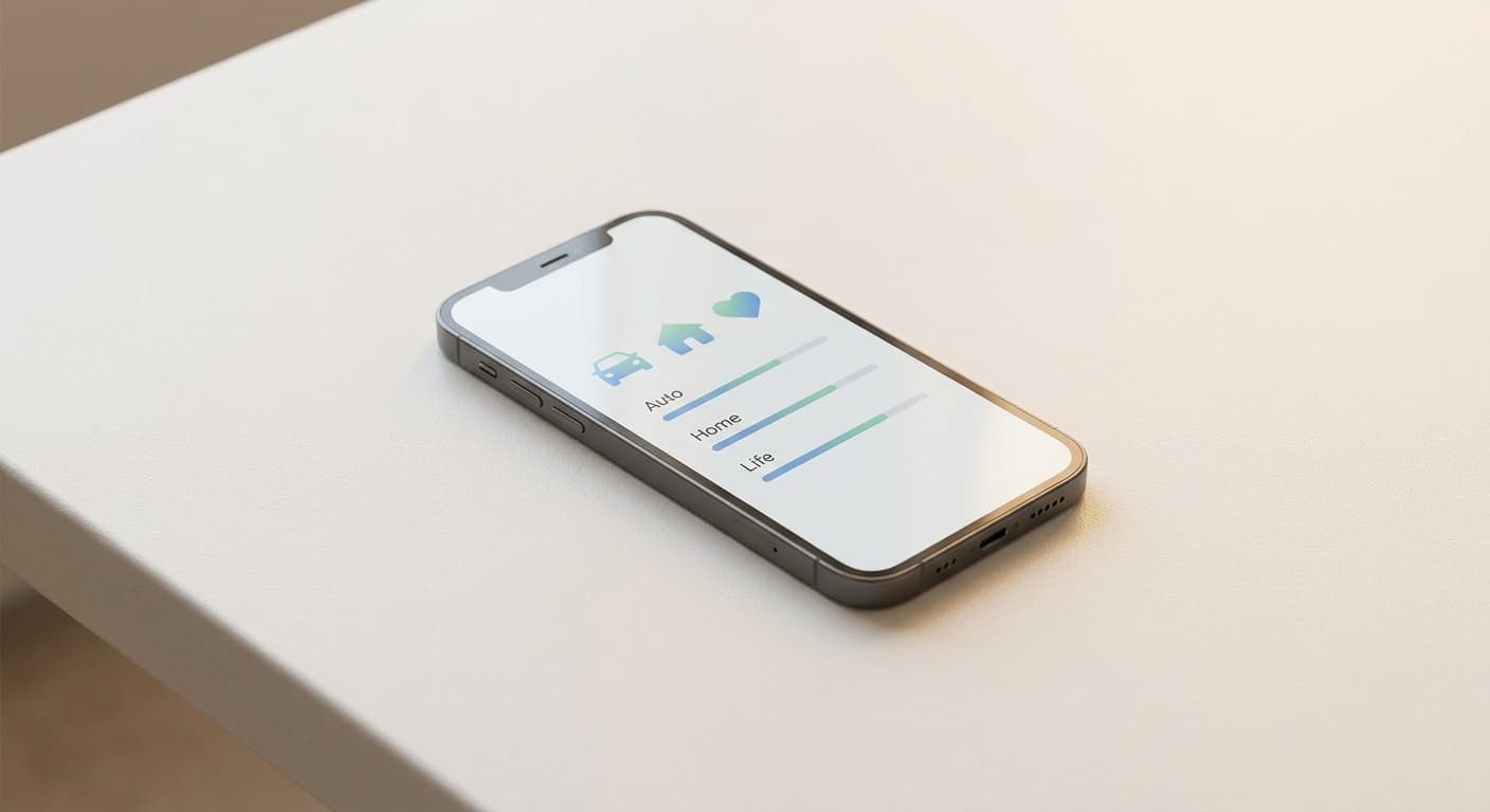
Modern SaaS aesthetic. Clean grids, balanced contrast, expected proportions, the conventions a designer reaches for from muscle memory. Stripe sits here. Linear sits here. Notion sits here. The Polished Standard system signals competence and professionalism. It is the right answer for most B2B products, even though most B2B products end up looking the same.
When it fits: high-credibility B2B contexts where the audience expects the conventions, or any product where the visual system should not be the brand's differentiation.
What it rejects: the temptation to be different at the visual level when the differentiation belongs in the writing or the positioning. Polished Standard pays its dues to the category and earns the right to differentiate elsewhere.

Controlled Maximalist.
High visual density where every element is intentional. Loud but engineered. Wieden+Kennedy print sits here. BUCK animation sits here. The Controlled Maximalist system commits to abundance and engineers it down to coherent output. Done well, it signals craft and conviction. Done poorly, it reads as the brand mistaking volume for energy.
When it fits: brands at full conviction, with the production budget to engineer abundance, in categories where loud is the category default and louder is the differentiation.
What it rejects: quiet as the only marker of taste. Controlled Maximalist brands trust that the reader can handle density when the density is engineered.
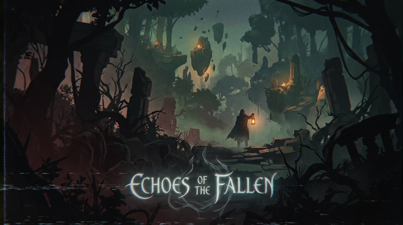
The showcase is light on this position because most B2B and consumer-D2C work picks one of the adjacent positions. The example below is the canonical Observatory Performance treatment, which sits at Controlled Maximalist with a Coach relationship.
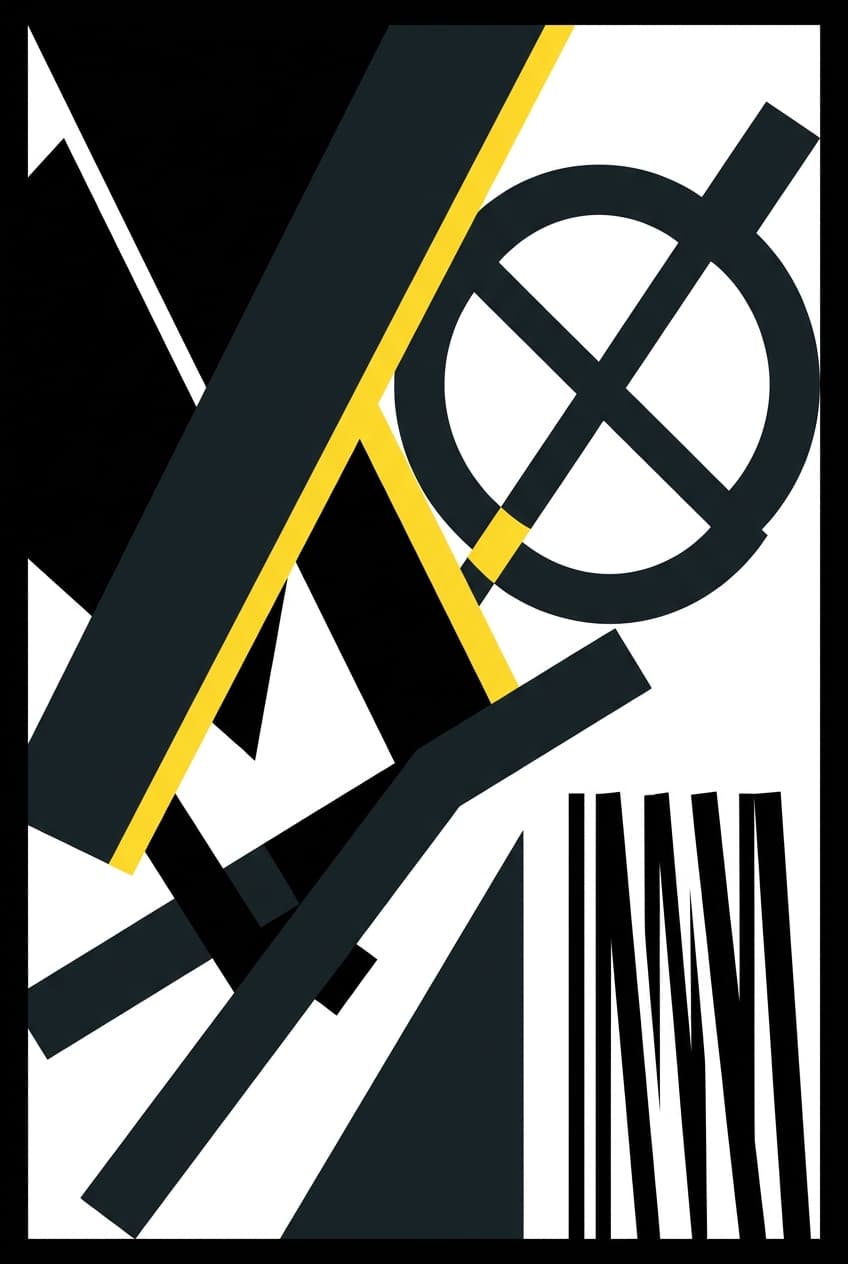
Expressive Maximalist.
Visual abundance, willingness to be loud, willing to clash. The Expressive Maximalist system signals energy and ambition. Hardest to execute well because the line between “loud and right” and “loud and wrong” is invisible until the work ships. Liquid Death sits here. Late-stage Off-White editorial sits here. In the showcase, Pulse, Vector, Vault, Edge, and a dozen others sit here.
When it fits: consumer brands committing to a strong point of view, categories where the audience expects energy as part of the value proposition, or any brand willing to alienate the wrong audience to attract the right one.
What it rejects: restraint as default taste. The position requires the brand to commit to an aesthetic that will not work in every context and will not appeal to every audience.

Composition
How aesthetic composes with the other three axes.
Aesthetic interacts most directly with sensory. Restrained-Resonant produces a quiet, considered emotional payoff (Hewn, Estate). Expressive-Resonant produces an architected feeling at high volume (Pulse, Vault). Restrained-Functional produces a utilitarian tool that respects the reader's time (parts of Stripe). Expressive-Functional is the rare combination, only viable when the audience rewards the contrarian move (Edge in the showcase).
Aesthetic interacts least with tone. Almost any tone position can pair with almost any aesthetic position; the showcase includes the full matrix as worked examples.
Aesthetic shapes downstream work through the brand-identity skill, which translates the aesthetic position into a logo system, color palette, type scale, and motion principles.
Failure patterns
Where aesthetic choices go wrong.
Polished Standard by default. The team picks Polished Standard because it is the safe option, then stops working on aesthetic. The result is a site whose only differentiation is the wordmark. Polished Standard is the right answer often, but only when the differentiation lives in the writing, the photography, or the positioning.
Restrained without earning it. Restrained design only works when the brand has the content to fill the space the design left for it. A Restrained homepage with thin copy and stock photography reads as empty rather than confident.
Maximalist without engineering. Loud but not coherent. The brand throws elements at the page hoping density will produce energy. Real Controlled Maximalist work engineers the density. Real Expressive Maximalist work commits to the clash. Both fail when the team imitates the aesthetic without committing to the work.
Aesthetic drift across surfaces. The homepage runs Restrained; the marketing email runs Polished; the dashboard inherits framework defaults. The aesthetic position has to apply everywhere, including the surfaces the founding designer never touched.
Frequently asked questions.
- What does the aesthetic axis answer?
- How much visual density the work carries, and how much each element earns its place. Four positions: Editorial Restrained (generous white space, single definitive image, low color count), Polished Standard (modern SaaS aesthetic, expected proportions), Controlled Maximalist (high density where every element is intentional), and Expressive Maximalist (visual abundance, willing to clash).
- Why are restrained and maximalist both valid?
- They answer different strategic questions. Restrained earns attention by deserving it. Maximalist captures attention by not letting it leave. Neither is inherently better; both are correct responses to the right context. Restrained reads as confidence in low-attention categories. Maximalist reads as energy in high-attention categories. The wrong choice for the context produces work that fails on its own terms.
- What is the most common aesthetic failure pattern?
- Picking Polished Standard by default and producing a brand indistinguishable from every other modern SaaS site. Polished Standard is the right answer for many B2B products, but the brand has to act like it earned somewhere else (in the writing, in the photography direction, in the typography choices). Most teams pick Polished Standard and stop working on aesthetic; the result is a category-default site whose only differentiation is the wordmark.