Skill · Creative direction

Creative direction.

Frameworks produce competent output. Coherent output requires a brief.

This skill turns vague creative intent into a structured brief that downstream skills can reference. It does not generate taste. It captures direction, so the dozens of small decisions a project requires (word choice, image selection, white space, sequencing, what to leave out) all answer to the same question.

What this skill produces

A markdown brief, not a moodboard.

The output is a single file (typically BRIEF.md) with the four axis selections, a synthesis paragraph that describes what the combination produces in practice, the inspiration references, and a rejection list. The rejection list is the most useful section. It names what the brief explicitly says no to: no testimonial walls, no stock photography, no exclamation marks. Without the rejection list, the brief is a wishlist; with it, it is a constraint a designer can actually use.

The brief becomes the reference every downstream skill checks against. Landing-page copy, art direction, content and copy, brand-style-guide, design-standards. Any work that produces an aesthetic artifact runs through it. The test of a good brief is whether the output would be different if a different brief were used. If the brief does not change the output, the brief is decoration.

The showcase below demonstrates the framework applied across forty-two fictional brands. Each one picked a specific combination of positions and produced a coherent visual system. Look at six examples to calibrate what the abstract labels look like in practice.

The framework

Four axes, asked one at a time.

A creative brief sits at the intersection of four axes. Each axis is a spectrum, not a binary. The user picks a position on each, knowing the choice excludes adjacent positions for this project.

1. Tone register

How formal is the work? How much heat does the language carry?

  • Professional. Measured, precise, low-register. Trusts the reader to do work. Restraint is the signal. Estate (luxury real estate) sits here: no exclamation marks, no urgency language, the property does the talking.
  • Conversational. Warmer, more personal, comfortable with first-person and contractions. Reads like a thoughtful person talking. Hewn (skincare) sits here: ingredient-literate but warm, second-person without pushing.
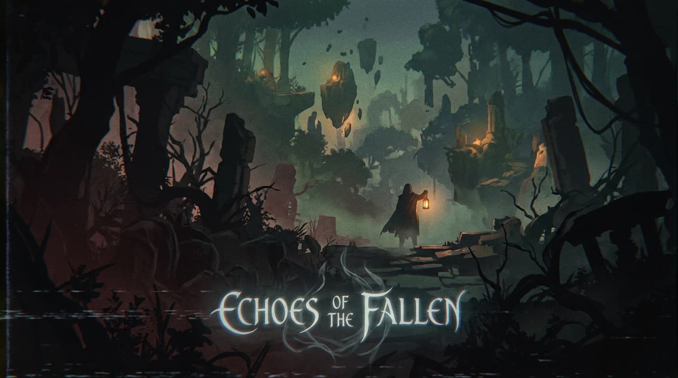
  • Playful. Wit, surprise, willingness to break form for effect. Risks the reader missing the point if not earned. Bloom (soda) and Pulse (music) sit here: the brand has license to make a joke because the rest of the work earns it.
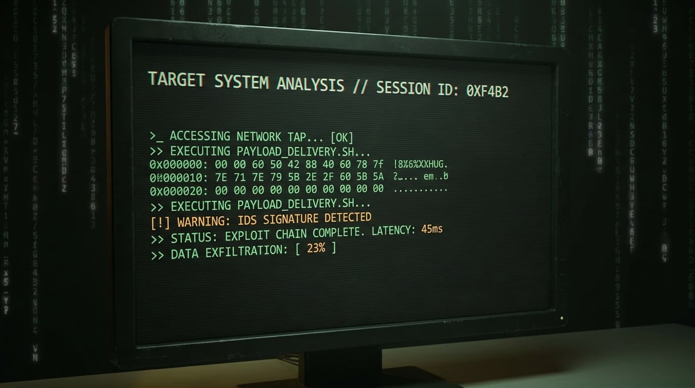
  • Provocative. Pointed, opinionated, willing to take a position other brands will not. Risks alienating people who do not share the position. Vector (offensive security) and Vault (game launch) sit here: the brand is not for everyone, and that is the point.

Choose by asking what the audience already gets too much of. Dry category? Conversational or playful is the differentiation. Loud category? Professional restraint is the differentiation. Read the tone axis hub.

2. Aesthetic philosophy

How much visual density does the work carry? How much does each element earn its place?

  • Editorial Restrained. Generous white space, single definitive image instead of grids, considered typography, low color count. Signals confidence and patience. Hewn and Estate sit here.
  • Polished Standard. Modern SaaS aesthetic. Clean grids, balanced contrast, expected proportions. Signals competence and professionalism. Most B2B sites should live here and try to act like they earned somewhere else.
  • Controlled Maximalist. High visual density where every element is intentional. Loud but engineered. Signals craft and conviction. Bloom and Observatory Performance sit here.
  • Expressive Maximalist. Visual abundance, willingness to be loud, willing to clash. Signals energy and ambition. Hardest to execute well. Pulse, Vector, and Vault sit here.

Choose by asking what the project says about the brand's relationship to attention. Restrained earns attention by deserving it. Maximalist captures attention by not letting it leave. Read the aesthetic axis hub.

3. Audience relationship

How does the brand position itself relative to the reader?

  • Authority. We tell you what is true. Implicit hierarchy, expertise on display, reader is the learner. Estate sits here: the brokerage knows the market and the buyer is invited to listen.
  • Peer. We are figuring this out together. Equal footing, shared vocabulary, reader is the co-thinker. Hewn and most of the Observatory archetypes sit here.
  • Companion. We walk with you. Lower hierarchy than authority, more presence than peer, reader is the protagonist of their own work. Pulse and Bloom sit here.
  • Coach. We challenge you. The brand pushes the reader toward something they would not push themselves toward alone, reader is the trainee. Vault and Observatory Performance sit here.

Choose by asking what the audience needs most. Audiences who feel lost want authority or coach. Audiences who feel patronized want peer or companion. The wrong choice patronizes or abandons the reader. Read the relationship axis hub.

4. Sensory ambition

How much is the work asking of the reader emotionally?

  • Functional. Get a job done. Reader gets in, gets the answer, gets out. Aesthetics serve clarity. Most utility tools live here. Edge (developer tool) is the pedagogical exception: Functional with maximalist visual energy, demonstrating that the axes are independent.
  • Considered. Reader notices the craft. Aesthetic choices are visible without being the point. Most premium brands live here. Hewn and Estate sit here.
  • Resonant. Reader feels something specific the brand architected. Aesthetics carry meaning. Hardest to produce. Pulse, Vault, and Vector sit here.

Choose by asking what the audience deserves from the experience. Functional respects time. Resonant respects feeling. The wrong choice either wastes attention or fails to deliver utility. Read the sensory axis hub.

Composition

How the brief feeds downstream work.

The brief is a gate, not a deliverable. Every skill that produces aesthetic output reads it before generating anything. Where it gets ignored, output drifts back toward category default. Where it gets honored, the work stays coherent across surfaces a single designer would never see in one sitting (homepage, error message, transactional email, social post, app icon).

The most direct downstream skill is brand voice. The tone axis sets the register; brand-voice operationalizes that register into voice attributes, vocabulary preferences, grammar rules, and a paired-example library. A brief that says “Conversational” produces a voice doc that names contractions as default, short paragraphs, second-person, and a list of the specific marketing cliches the brand will not use.

The visual system runs through brand identity. The aesthetic and sensory axes constrain the identity system: a Restrained-Considered brief produces a small color palette, a single confident typeface, a low-density grid, and motion principles that read as restraint. Expressive-Resonant produces the opposite. Both are coherent if the brief was honored.

Conversion-focused work runs through landing-page copy. The four axes constrain hero structure and CTA voice. A Coach-Provocative brief writes a different hero than a Peer-Conversational brief, even if the offer is identical. The framework decides whether the page reads as a challenge or an invitation.

Other downstream skills consume the brief at decision points: art-direction picks photography style and lighting, content-and-copy picks editorial structure and pacing, design-standards picks density and contrast defaults, landing-page-copy picks objection-handling format. The brief is reference material for the project's life, not a one-time deliverable.

Failure patterns

Where this skill goes wrong.

Using the framework to develop taste. The skill codifies intent. It does not produce judgment. A team running creative-direction without any reference examples or comparative work tends to pick comfortable middle positions on every axis (Polished Standard, Peer, Considered) and produce a brief that reads competent and describes nothing.

Skipping the inspiration references. The references calibrate what the axis positions mean in practice. A user picking Editorial Restrained without examples often means something different than what an art director means by it. Ask for two or three reference URLs and a sentence on what specifically resonates. The answer clarifies axis position better than abstract description.

Treating positions as absolute. A project at Conversational still has moments of authority and play. The position is the gravitational center, not a fence. Error states from a Conversational brand can read more authoritative without breaking voice. The framework describes the default; exceptions are conscious choices.

Brief drift mid-project. The most common failure. The brief gets written, then ignored. Every downstream skill should re-read the brief before producing output. If a skill wants to violate the brief, the violation is a decision the user makes consciously, not an accident. Brief drift is the reason most rebrands look like the previous brand with a paint refresh.

Picking incompatible combinations without flagging. Functional + Provocative is technically valid but very hard. Provocation usually requires emotional engagement that pure functional work resists. The skill should surface that the combination is rare and ask the user to confirm. The showcase includes Edge as a pedagogical exception (HIGH-Functional with maximalist energy) and Studio as another (LIGHT-Provocative with editorial restraint), both demonstrating that the rare combinations can work but require unusual care.

Producing a brief no one references. A brief that does not change downstream output is decoration. The test of a good brief is whether the output would be different if a different brief were used. If the designer's first draft would have been the same regardless, the brief never landed.

Frequently asked questions.

What is the creative direction framework?
A structured brief built from four directional axes: tone register (how formal the language reads), aesthetic philosophy (how dense the visual system is), audience relationship (how the brand positions itself to the reader), and sensory ambition (how much the work asks of the reader emotionally). Each axis offers a small set of positions. The combination produces a brief that downstream skills (content, copy, design, art direction) reference when producing artifacts.
How is this different from a normal creative brief?
A creative brief covers the operational kickoff: scope, audience, deliverables, constraints, success criteria. The creative direction skill goes deeper on aesthetic axes specifically. The two compose: run creative-brief for the operational layer, then creative-direction to set the aesthetic axes. The aesthetic brief becomes a project artifact (typically saved as BRIEF.md) that every downstream skill checks against.
Can I see what a brief produced by this framework looks like in practice?
Yes. The creative direction showcase demonstrates the framework applied across forty-two fictional brands. Each brand picks specific positions on each axis, and you can see how those abstract labels translate into a typographic system, copy register, color choice, and pacing. Each axis position links to the showcase pre-filtered to examples matching that position.
Do I need design taste to use this skill?
The skill codifies intent. It does not develop judgment. A team with no taste who runs this still produces incoherent work; the brief just makes the incoherence consistent. The skill is most useful for teams who can recognize work they like but cannot articulate the decisions that produce it. It is an articulation tool.