Aesthetic axis · Position 1 of 4
Editorial Restrained aesthetic in Creative Direction
The most disciplined visual position in the creative direction framework. Generous white space, single decisive image, considered typography.
Editorial Restrained is the visual system that signals confidence by refusing to grasp for it.
What Editorial Restrained is
Editorial Restrained is the visual end of the aesthetic axis where every element is asked to justify its presence on the page. White space is generous and asymmetric. Type does most of the work. Imagery, when it appears, tends to be a single decisive image rather than a grid of supporting visuals. Color counts are low: typically a base, an accent, and a hairline. The system reads as quiet, but the discipline of producing it is loud.
The position rewards craft that is visible only on a second look. Type pairings are considered. Margin sizes are not arbitrary. Negative space is composed, not residual. A site at this position passes the test of feeling intentional even when the reader cannot articulate what makes it so. The aesthetic is the brand's first credibility check before the copy has done any work.
When Editorial Restrained fits
Editorial Restrained fits categories where the buyer reads visual restraint as signal of substance. Luxury real estate, fine dining at the institutional registers, premium audio, law, design studios, museum-grade home goods. Buyers in these categories know what an over-designed site signals about the firm behind it. Restraint is the precondition for being taken seriously, not a stylistic choice.
The position also fits brands whose primary asset is the asset itself: a property, a dish, a piece of work. A site that competes for visual attention with its own product is choosing wrong. Editorial Restrained gets the chrome out of the way and lets the asset land. A magazine knows this discipline well; brands at this position are borrowing it.
What Editorial Restrained rejects
Editorial Restrained is not Sparse and not Empty. Sparse reads as unfinished; empty reads as unconfident. The position rejects both by ensuring that every present element is highly considered. A page with very few elements but each one wrong is not Editorial Restrained; it is a draft.
The position rejects grid-of-thumbnails browsing patterns, image carousels by default, hero photos with overlaid CTAs, and the broader pattern of treating every above-the-fold pixel as an opportunity to convert. The discipline is to choose the one element worth defending and let the rest of the page support that choice.
Examples in the showcase
12 archetypes that demonstrate Editorial Restrained
Editorial Restrained is the most-populated position on the aesthetic axis because so many premium brands depend on it. The archetypes below cover the range from law to fine dining to luxury real estate to the deliberate Provocative-Restrained move that the Studio archetype demonstrates.
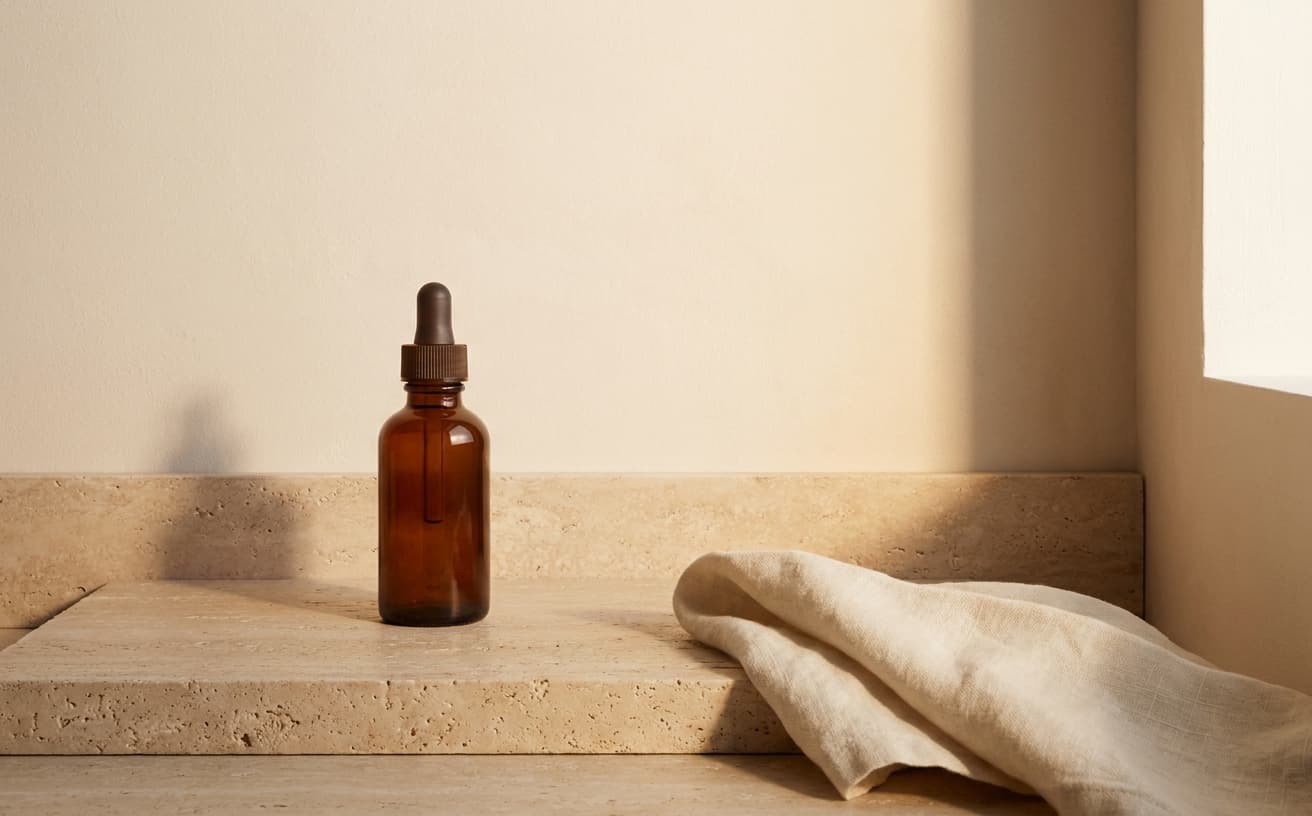
Hewn
Clean skincareHewn is single dropper-bottle hero, generous margins, citations at the bottom. The Editorial Restrained aesthetic is what allows the science-confident Conversational tone to feel like an editorial rather than a sales pitch.
See the archetype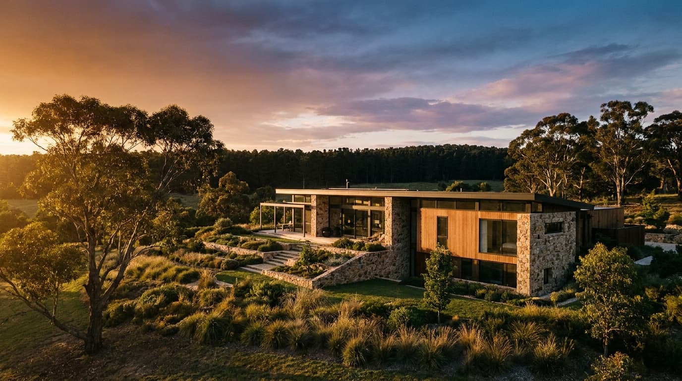
Estate
Luxury real estateEstate uses a single full-bleed property hero per page, principal letter rather than agent grid, restrained collection strip. The position does the work of signaling the price tier before any copy is read.
See the archetype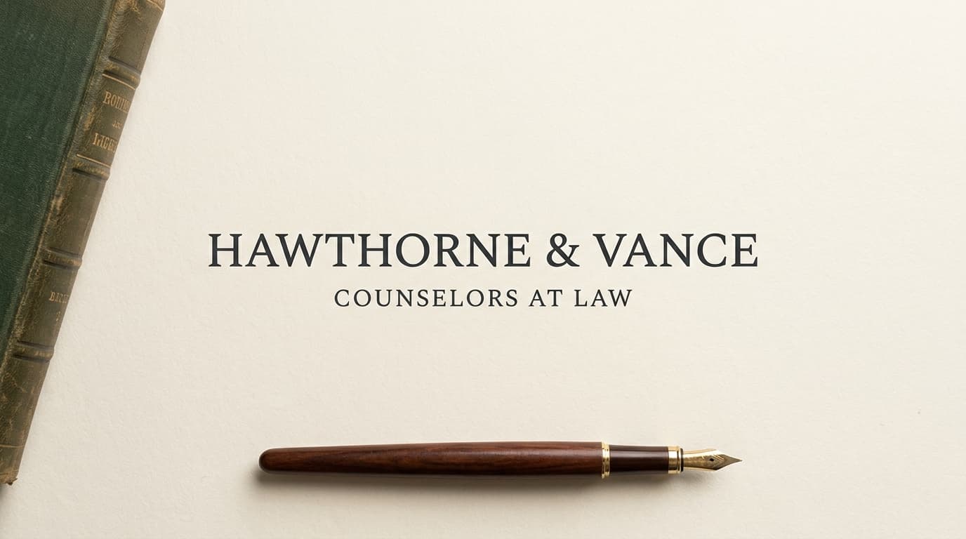
Counsel
Business law firmCounsel reads like a memo. Typographic hero with serif lockup, white space at reading-margin generosity, no hero photography. The aesthetic refuses the marketing-page conventions that read as small-firm at the prestige tier.
See the archetype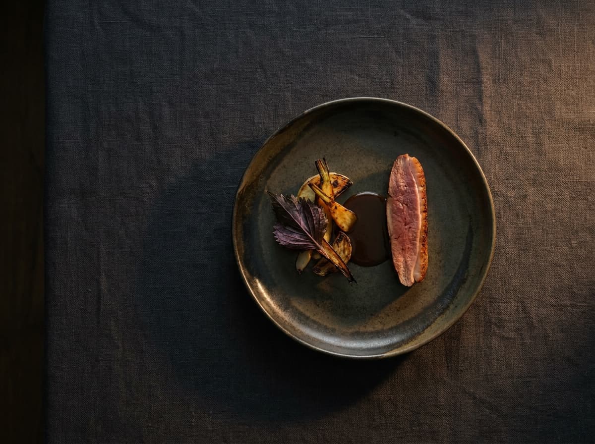
Pass
Fine dining groupPass is edge-to-edge dish hero, dark warm base, saffron accent. The Editorial Restrained aesthetic is what allows the food photography to be the entire point of the page.
See the archetype
Fieldwork
Brand and product design studioStudio is the pedagogical pairing of Editorial Restrained with Provocative tone. The work breathes on the page; the studio's worldview lives in the prose. The aesthetic refuses to compete with the work the studio is showing.
See the archetype
Anode
Premium electric vehiclesAnode is cinematic, declarative, no-qualifier. A premium EV that treats engineering as art. Editorial Restrained is what allows the manifesto-adjacent tone to land without theatricality.
See the archetype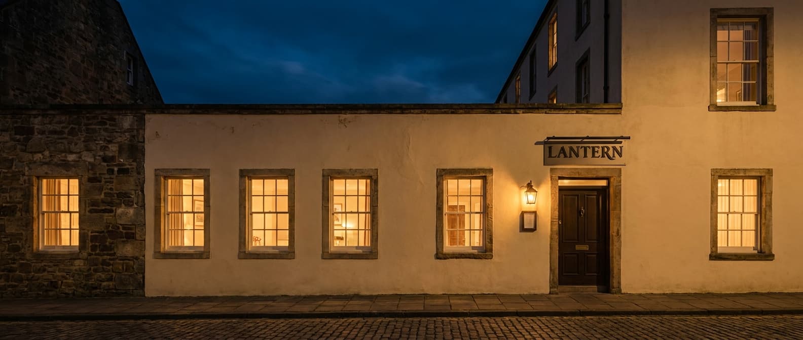
Lantern
Boutique hotelLantern is golden-hour atmospheric photography over slow parallax, single muted accent. The Editorial Restrained aesthetic supports the cinematic Resonant sensory ambition without crossing into travel-brochure register.
See the archetype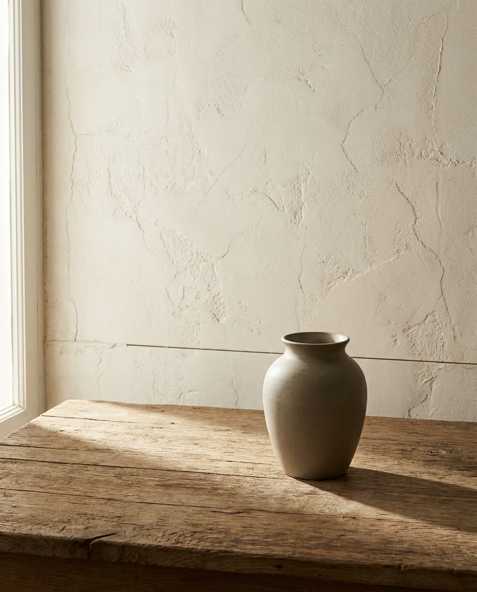
Prospect
Home decor and craft objectsProspect is catalog-grade home brand. Maker provenance, third-person about the makers, restrained palette. The aesthetic is what lets the brand operate at the museum-gift-shop register.
See the archetype
Observatory Editorial
Observatory Editorial is the canonical reference for Editorial Restrained inside the framework. Documentation that decided to be a marketing site. The aesthetic is the floor.
See the archetype
Observatory Cinema
Cinema is the Provocative-Restrained move at the framework level. Atmospheric stills, type at scale, restrained UI. The aesthetic supports narrative without staging it.
See the archetype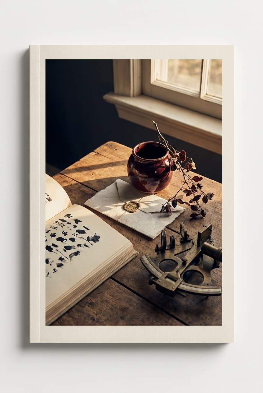
Observatory Press
Press is the editorial publication archetype. Heavy display typography, asymmetric layouts, image-led, drop caps. The aesthetic is borrowed directly from print magazines that have spent a century refining the discipline.
See the archetype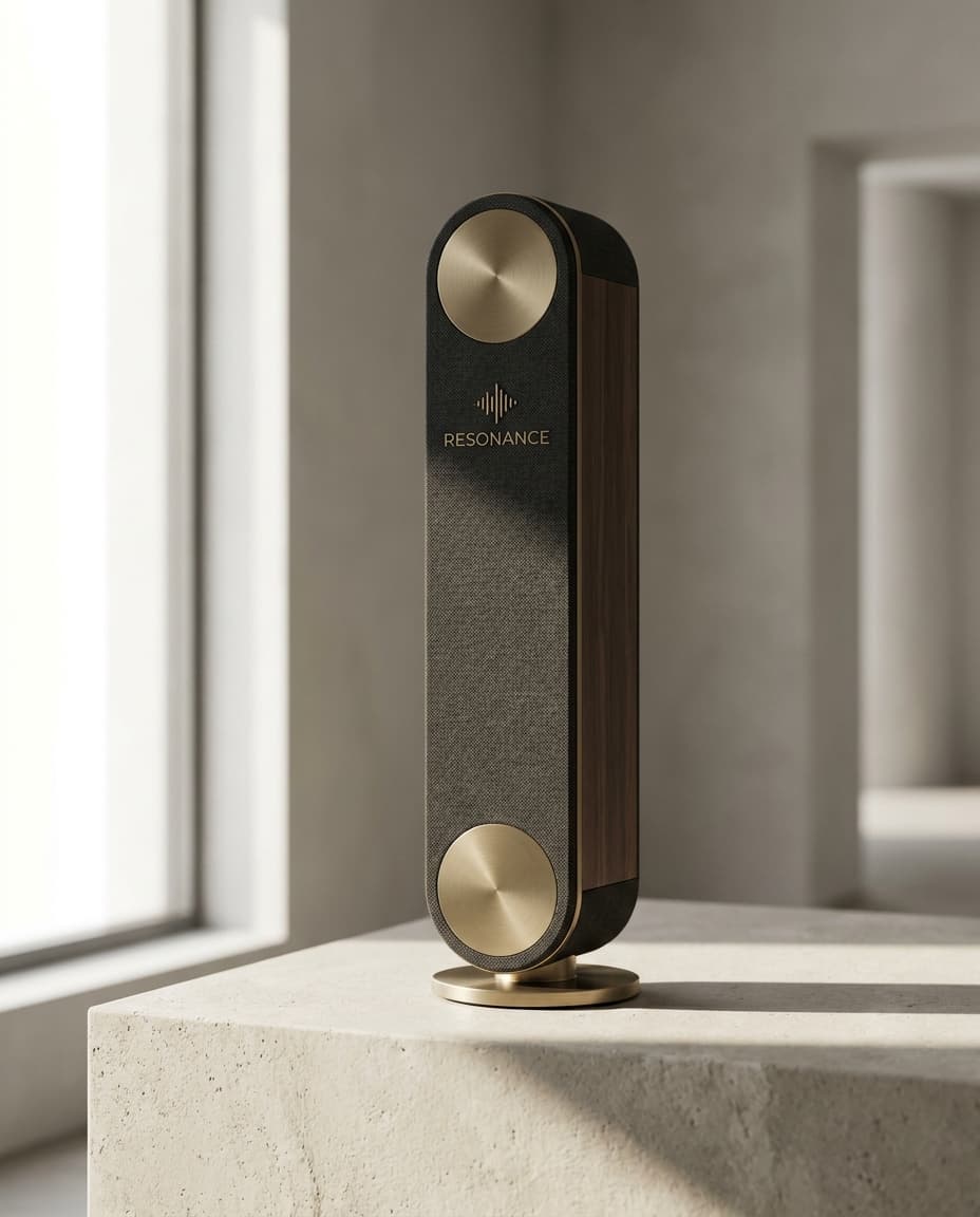
Resonance
Premium audio hardwareResonance is 3D product rotation, exploded-view detail shots, audiophile-literate. Editorial Restrained is what lets the premium audio brand signal craftsmanship without the Maximalist photography that competitors lean on.
See the archetype
How Editorial Restrained composes with the other axes
Editorial Restrained pairs most often with Considered or Resonant on the sensory axis. With Functional sensory the combination produces Observatory Reference's institutional documentation register. With Resonant the combination becomes the cinematic-editorial mode (Cinema, Lantern, Pass, Estate).
On the tone axis, Editorial Restrained pairs with all four positions. Professional is the most common pairing (Counsel, Estate, Reference, Plan, Resonance). Conversational pairs produce the Hewn / Pass / Lantern register. Provocative pairs produce the Cinema / Anode / Studio register. Playful with Editorial Restrained is the rarest combination and is closest to Workshop's pattern.
Failure patterns
How Editorial Restrained fails
Concrete patterns to watch for when adopting the position. These are the failure modes the position has to guard against, in order of how often they appear in the wild.
Failure pattern 1
Confusing restraint with sparse
Pages that strip elements without composing what remains read as unfinished, not as confident. The discipline is that every remaining element has to be highly considered. A page with five elements all wrong is worse than a page with twenty elements all right.
Failure pattern 2
Hiding craft to the point of looking lazy
Editorial Restrained that removes all decorative elements but does not invest in typography, spacing, or image quality reads as a brand that ran out of budget rather than as a brand that chose discipline. The position requires the budget to land in fewer places.
Failure pattern 3
Restraint in the layout, hype in the copy
The aesthetic and the voice have to commit together. A site that uses Editorial Restrained layout but writes Provocative-Maximalist copy reads as borrowed visual chrome on a different brand's voice. The compositions in the framework hub at /framework/creative-direction show which combinations land.
Failure pattern 4
Treating Editorial Restrained as the safe luxury default
Brands that arrive at the position because it feels expensive miss the discipline. The position is not a finish; it is a construction. Restraint that has not been earned by craft reads as an empty page.
References