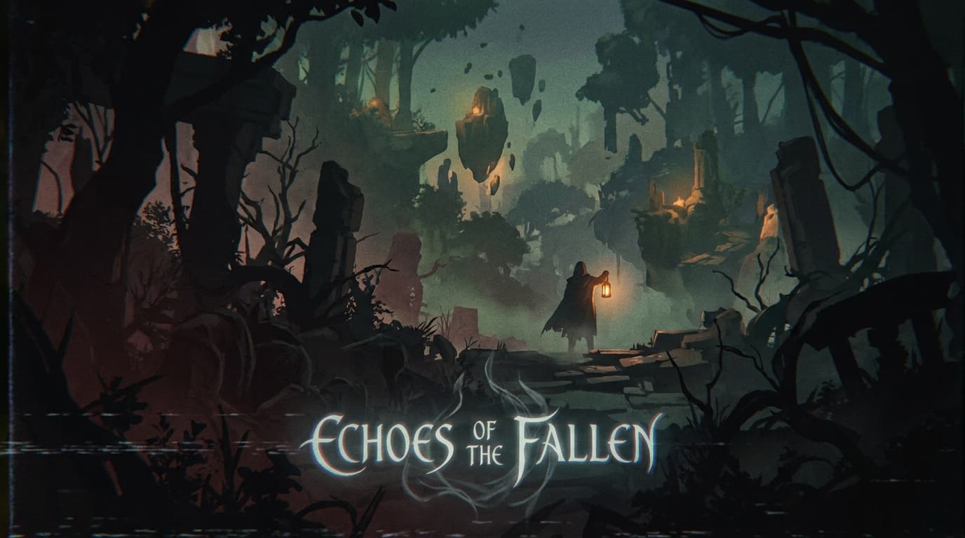
Framework · Axis 4 of 4
Sensory in creative direction.
How much is the work asking of the reader emotionally?
The sensory axis sets the emotional ambition of the work. The position picked here propagates into pacing, motion choices, photography direction, the question of whether the page should rush the reader to the action or hold them in a moment, and the question of how much the reader should feel before doing.
The question
What does this axis answer?
The sensory axis answers what the reader deserves from the experience. Functional respects time. Considered respects attention. Resonant respects feeling. Each position commits to a different relationship with the reader's most scarce resource. The wrong choice wastes the reader's time, fails to reward their attention, or leaves them flat when the brief promised feeling.
Three positions span the meaningful spectrum without overlap. Functional commits to utility. Considered commits to noticeable craft. Resonant commits to architected feeling. The dispatch should pick the position the audience showed up for, not the position the brand wishes the audience had showed up for.
Functional.
Get a job done. The reader gets in, gets the answer, gets out. Aesthetics serve clarity. Most utility tools live here. Plain Stripe Dashboard sits here. The npm registry sits here. The IRS website sits here at its calmest. In the showcase, Edge (developer tool) is the pedagogical exception: Functional with maximalist visual energy, demonstrating that the axes are independent.
When it fits: utility products, dashboards, technical reference, search tools, transactional surfaces, anywhere the reader is there to complete a task and leave.
What it rejects: emotional ambition that gets in the way of the task. The Functional brand trusts that the task is the entire reason the reader showed up.
Considered.
The reader notices the craft. Aesthetic choices are visible without being the point. Most premium brands live here. Aesop sits here. Apple at its calmest sits here. In the showcase, Hewn, Estate, Carepath, Counsel, and Fieldwork (Studio) sit here. The Considered position rewards the reader who pauses to notice without demanding the pause.
When it fits: premium positioning, considered purchase decisions, service categories where the work has to feel earned, or any context where the brand can afford to reward the attention it asks for.
What it rejects: visual abundance for its own sake, motion that calls attention to itself, the kind of execution where the craft becomes the message.


Resonant.
The reader feels something specific the brand architected. Aesthetics carry meaning. Hardest to produce. Cinematic product launches sit here. Apple film sits here. In the showcase, Pulse, Vault, Vector, Estate, and most of the brand-aesthetic-push archetypes sit here. The Resonant position rejects restraint as the goal; it commits to a feeling and accepts that some readers will not feel it, which is acceptable as long as the right ones do.
When it fits: consumer brands where feeling is the value, lifestyle categories, narrative-driven products, or any brand willing to invest in the production budget that architected emotion requires.
What it rejects: the assumption that craft alone produces feeling. Resonance is engineered: by sequence, by pacing, by the specific combination of image and sound and copy. It does not happen by accident; it does not happen by adding a transition.


Composition
How sensory composes with the other three axes.
Sensory interacts most directly with aesthetic. Restrained-Resonant produces a quiet, considered emotional payoff. Expressive-Resonant produces an architected feeling at high volume. Restrained-Functional produces a tool that respects the reader's time. Expressive-Functional is the rare combination, viable when the audience rewards the contrarian move (Edge in the showcase).
Sensory also interacts with relationship. Coach-Resonant produces the architected emotional payoff that performance categories reward. Coach-Functional usually fails because the reader signed up for utility, not a challenge.
Sensory shapes downstream work through the brand-identity skill (motion principles, photography direction) and the landing-page-copy skill (pacing, the question of whether to slow the reader down before the CTA or rush them to it).
Failure patterns
Where sensory choices go wrong.
Resonant when the reader showed up for utility. A B2B onboarding flow does not need an architected emotional payoff. The reader signed up to complete a task. Treating the task as an opportunity for feeling wastes the reader's attention.
Functional in lifestyle categories. The flip side. A consumer lifestyle brand picking Functional produces work that feels transactional in a category where feeling is the value. The reader leaves without a reason to come back.
Considered as the safe default. Considered is the comfortable middle. Most teams default here without committing. The result is work that is pleasant and forgettable. Considered only earns its position when the brand has the content to fill the space the design left for it.
Resonance by accident. Adding a fade transition is not Resonant. Adding a cinematic loop is not Resonant. Resonance is engineered by sequence, pacing, and the specific combination of image, sound, and copy. Unintentional Resonant work tends to land as overproduced.
Frequently asked questions.
- What does the sensory axis answer?
- How much the work asks of the reader emotionally. Three positions: Functional (get a job done; aesthetics serve clarity), Considered (the reader notices the craft; aesthetic choices are visible without being the point), Resonant (the reader feels something specific the brand architected; aesthetics carry meaning).
- Why does the sensory axis have three positions instead of four?
- The three positions span the meaningful spectrum without overlap. Functional commits to utility. Considered commits to noticeable craft. Resonant commits to architected feeling. A fourth position would either duplicate one of these (a 'highly resonant' position is just Resonant with strong execution) or live outside the spectrum (decoration is not a sensory position; it is a sign the work has lost the brief). The other axes have four positions because their spectrums genuinely have four meaningful stops; sensory has three.
- What is the most common sensory failure pattern?
- Picking Resonant when the reader showed up for utility. A B2B onboarding flow does not need to be Resonant; it needs to be Functional with enough Considered touches to feel branded. The reader signed up to complete a task. Treating the task as an opportunity for an architected emotional payoff wastes the reader's attention and signals the brand has misread what the audience came for. The flip side fails too: B2C lifestyle brands picking Functional and producing work that feels transactional in a category where feeling is the value.