Sensory axis · Position 1 of 3
Functional sensory in Creative Direction
The get-the-job-done sensory position in the creative direction framework. Aesthetics serve clarity, not the other way around.
Functional is the design that has decided clarity is the entire aesthetic responsibility, and refuses to apologize for it.
What Functional is
Functional is the sensory position where the page exists to help the reader get a job done. The reader gets in, gets the answer, and gets out. The aesthetic is calibrated to clarity: typography prioritizes legibility over distinction, color prioritizes contrast over mood, and motion serves comprehension rather than atmosphere. The position is the floor of the sensory axis; everything above it on the axis adds aesthetic responsibility, and Functional is the position that refuses the addition on principle.
The position is not the same as the absence of design. A Functional site at high craft is highly designed; the design is just calibrated entirely to utility. Reference materials, technical documentation, infrastructure tooling, dense data displays, transactional flows. The reader has come for a specific outcome and the page is engineered to deliver it. Aesthetic decisions are made in service of that delivery, not as a counterweight to it.
When Functional fits
Functional fits brands whose primary value to the reader is information density or transactional efficiency. Reference documentation, dashboards, search interfaces, dev tools at the systems layer, financial terminals, government services. The reader is doing work; the page is the tool. Adding aesthetic ambition beyond clarity tends to slow the work and lose the user.
The position also fits brands whose audience is allergic to aesthetic ambition that does not serve a function. Senior engineers buying systems infrastructure, oncology researchers using clinical reference, financial analysts using terminal data. The audience reads decoration as a tell that the team behind the brand is optimizing for the wrong audience. Functional is the position that signals the brand is built for the people who use it for hours every day.
What Functional rejects
Functional is not cold, and it is not the abdication of aesthetic responsibility. The position rejects the move of saying "we are a tool, not a brand" as if that excused under-investment in typography, contrast, or motion. A Functional site at high craft is more legible, more comfortable, and more durable than a Functional site at low craft. The discipline is to invest in the aesthetic exactly where it serves utility.
The position rejects the assumption that ugliness is a signal of competence. Brutalist Functional that is genuinely ugly tends to lose the audience it most wanted, because senior engineers who care about craft can tell the difference between earned brutalism and lazy ugliness. The position rewards investment; it just rewards investment that lands in usability rather than in adornment.
Examples in the showcase
8 archetypes that demonstrate Functional
Functional is the smallest-population position on the sensory axis because the showcase concentrates on commercial brands that need at least Considered to land. The archetypes below include the deliberate pedagogical exception (Edge) where Expressive Maximalist aesthetic serves Functional sensory ambition.
Edge
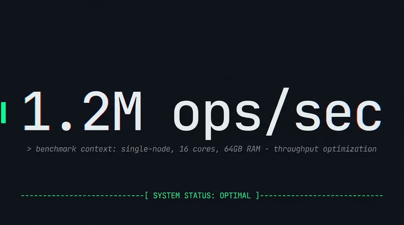
Systems-level developer toolEdge is the deliberate pedagogical exception. Expressive Maximalist aesthetic in service of Functional sensory ambition. Massive monospace benchmark numbers as the visual hero, ASCII dividers, install instructions as primary CTA. The maximalism is the dialect of the audience, not the goal of the page.
See the archetype
Cover
Direct-to-consumer insuranceCover sits between Functional and Considered; the quote-flow side of the experience leans Functional. Honest about pricing, the math shown, three-minute completion. Functional in consumer DTC is the bet that the buyer will reward time saved over experience polish.
See the archetype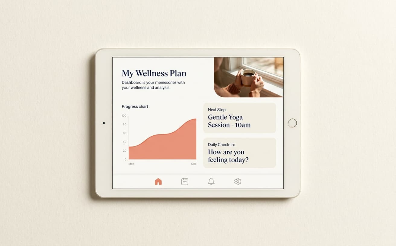
Carepath
TelehealthCarepath leans Considered overall but the booking and dashboard surfaces are Functional. The patient needs to manage care in finite time. The Functional zones inside a broader Considered system are how healthcare brands keep utility in the relationship.
See the archetype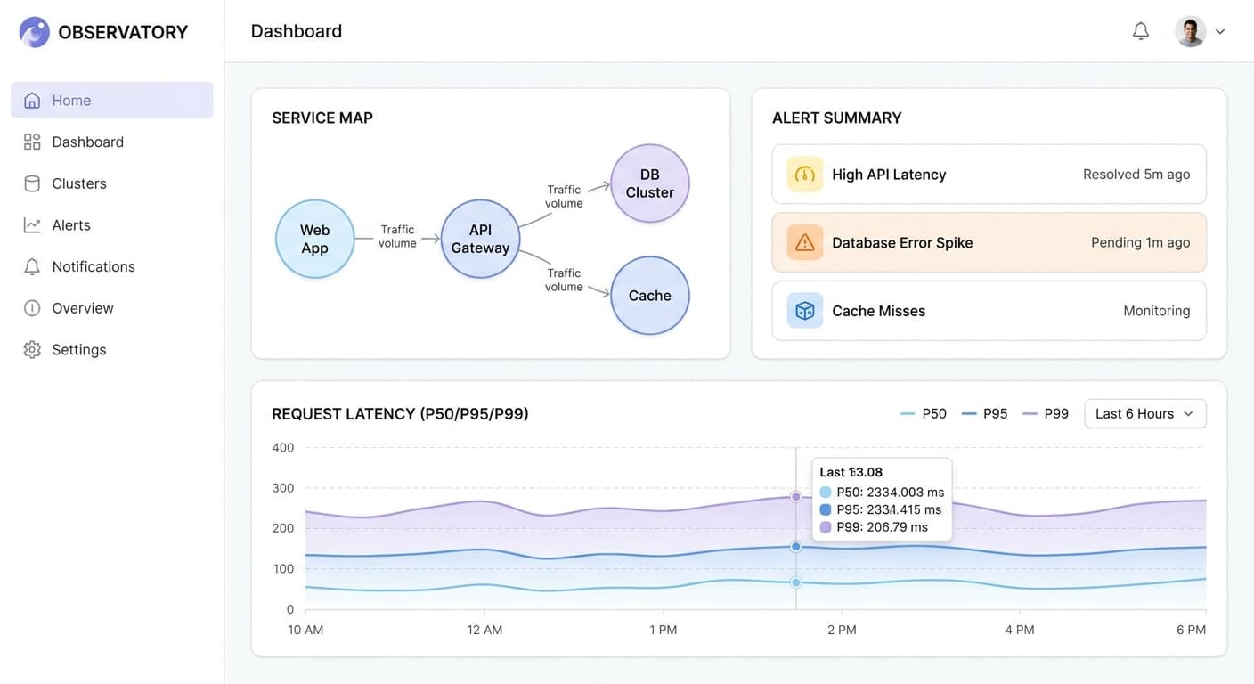
Observatory Standard
Observatory Standard sits between Functional and Considered for similar reasons; the dashboard mockup hero leans Functional, while the page-level layout leans Considered. The combination is the modern B2B SaaS register where utility and polish co-exist.
See the archetype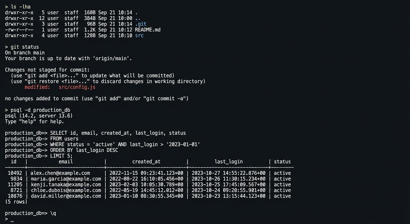
Observatory Workshop
Workshop is a developer tool that decided to be funny. Dark terminal mockup as hero, syntax-highlighted commands. Functional is the floor; the Playful tone is layered on top without compromising the utility.
See the archetype
Observatory Reference
Reference is the canonical Functional anchor inside the framework. Bloomberg-grade institutional documentation, footnotes, citations. The reader is here for facts and the page is engineered for that delivery.
See the archetype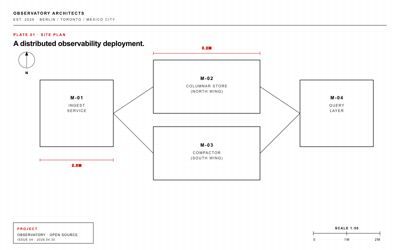
Observatory Plan
Plan is the architectural-drawing register. Axonometric diagrams, dimensional callouts, plate numbers. Functional in the architectural sense: the drawing is engineered to communicate the building.
See the archetype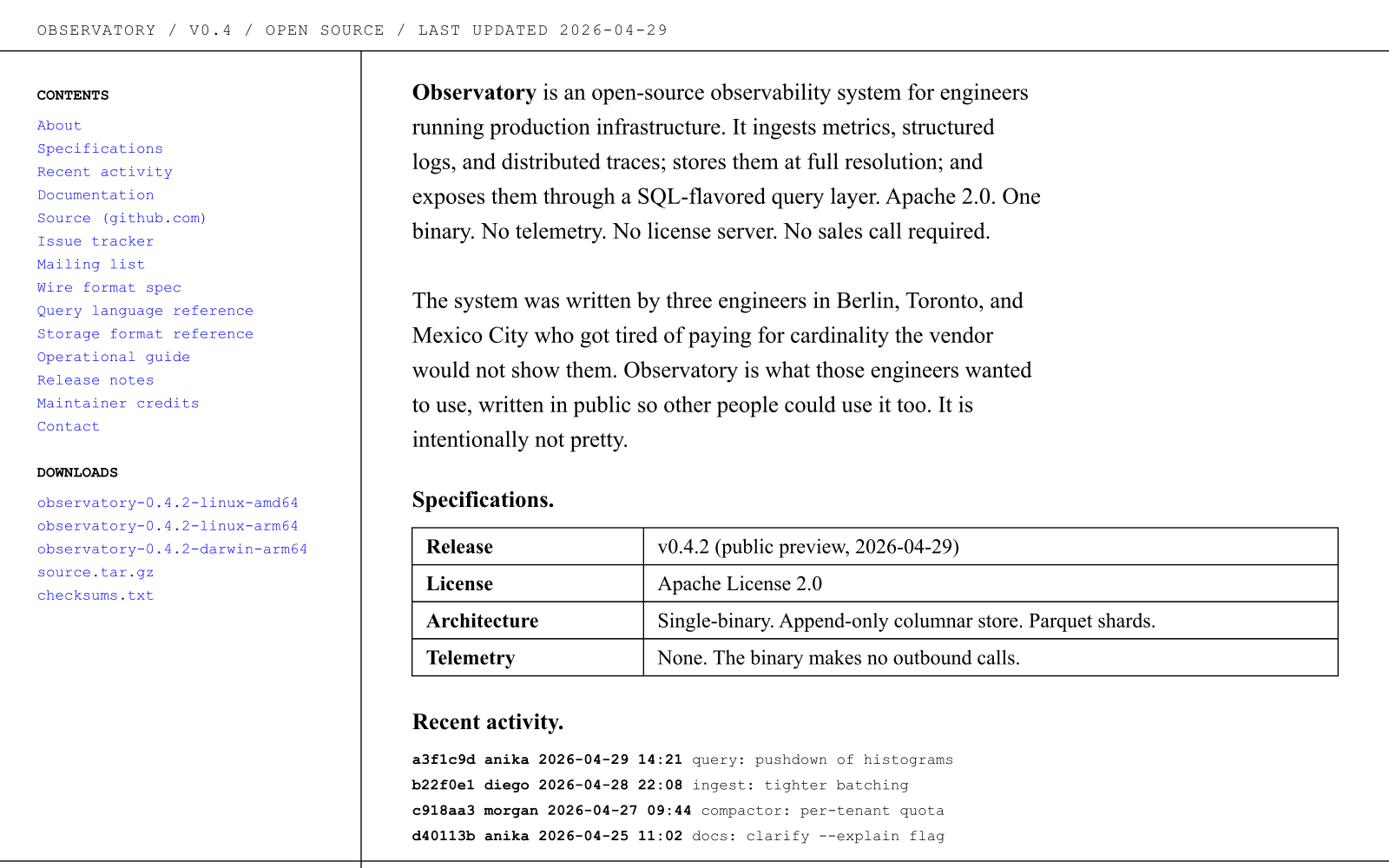
Observatory Raw
Raw is anti-design as design. Times New Roman, harsh borders, no decoration. Functional through rejection of decoration; the information is the aesthetic.
See the archetype
How Functional composes with the other axes
Functional pairs most often with Polished Standard or Editorial Restrained on the aesthetic axis. The Editorial Restrained pairing produces the institutional-documentation register (Reference, Plan). The Polished Standard pairing produces the dev-tool register (Workshop, Standard). The Expressive Maximalist pairing is the deliberate Edge exception: Maximalism in dialect of the audience, in service of utility.
On the relationship axis, Functional sits with Authority (Reference, Plan), Peer (Edge, Workshop, Standard, Raw), or Companion at the supporting-utility variant (Carepath surfaces). Functional with Coach is rare and produces the Hexa-adjacent register where the tool pushes the user toward better practice through clarity.
Pedagogical exception
The Edge pedagogical exception
Edge is intentionally placed at HIGH motion, Provocative tone, Expressive Maximalist aesthetic, and Functional sensory. It is the only HIGH-motion archetype in the showcase with Functional sensory ambition. The placement teaches a structural point about the framework: the Maximalist aesthetic can be deployed in service of utility rather than in service of resonance, when the audience reads the Maximalism as the dialect of the category.
Edge's site uses massive monospace benchmark numbers as the visual hero, ASCII dividers between sections, terminal cursor strobes, and install instructions as the primary CTA. The maximalism is dialect-fluent for systems engineers; the goal of the page is to demonstrate the tool's utility immediately. Resonance would distract from the goal. Functional with Expressive Maximalist is rarer than Functional with Editorial Restrained, but it is no less valid; the framework permits the combination for brands whose audience already speaks the maximalist dialect natively.
Failure patterns
How Functional fails
Concrete patterns to watch for when adopting the position. These are the failure modes the position has to guard against, in order of how often they appear in the wild.
Failure pattern 1
Cold and inhuman
A Functional site that strips all human texture in the name of utility loses the audience that needed warmth to trust the tool. The discipline is to keep utility primary while not refusing acknowledgement of the human at the keyboard. Friendliness in the right places does not compromise Functional.
Failure pattern 2
Refusing aesthetic responsibility entirely
"We're a tool, not a brand" is the abdication that the position has to guard against. A Functional site still has to be designed; the design just serves utility. Brands that confuse Functional with permission to skip design produce work that loses the readers they most wanted.
Failure pattern 3
Mistaking utility for permission to be ugly
Ugly Functional reads as lazy, not as serious. Senior engineers who care about systems also care about typography; ignoring the second to claim seriousness about the first is a loss. The position rewards craft that serves utility, not the absence of craft.
Failure pattern 4
Functional hero, Maximalist everywhere else
A site that opens with a Functional hero and fills the body with Maximalist storytelling produces an inconsistent register. The reader bounces between modes. The position requires consistency: if the brand is Functional, the consistency holds throughout the experience.
References