Logo Design Showcase · CPG
Wren & Bough
Pantry goods, considered.
A specialty pantry goods brand selling small-batch jams, olive oils, vinegars, and honeys at retail. The brand needs shelf presence at retail distance, a treatment that survives reproduction on glass labels and label paper, and an illustration vocabulary distinct from the artisan-script-with-laurel-wreath CPG default.
The brief
Wren & Bough sells preserved goods at the considered end of specialty grocery. Customers buy by ingredient origin and read the small-print provenance card inside the box. The mark has to survive on a glass jar label viewed at shelf-reading distance, on an olive oil bottle at a slimmer label format, on retail shelf strips, on tissue paper packaging, and at favicon scale. Cliches to avoid: the artisan script with laurel wreath, the rustic-cabin aesthetic that signals farmstand rather than considered pantry, and the generic farm-bird illustration.

Primary mark
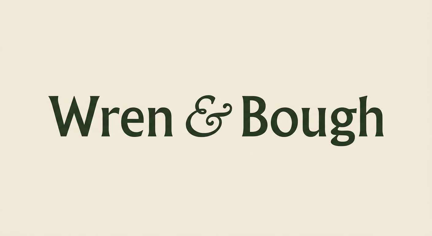
Lockup in Humanist sans
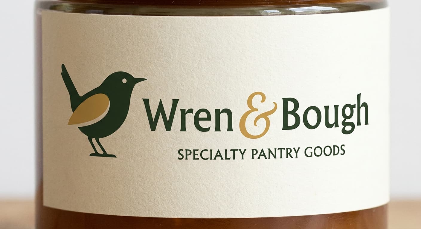
An illustrated wren silhouette beside the wordmark Wren & Bough in Albertus Pro. The bird is two-tone (forest body, honey accent on the wing) and reads as a refined heritage mark rather than a generic farm bird. The ampersand carries decorative weight as a calligraphic flourish between the two words. Reference: Method Home, Hu Chocolate, Mast Brothers label treatments.
Reference: Method Home, Hu Chocolate, Mast Brothers, Aesop labelling
Variant exploration
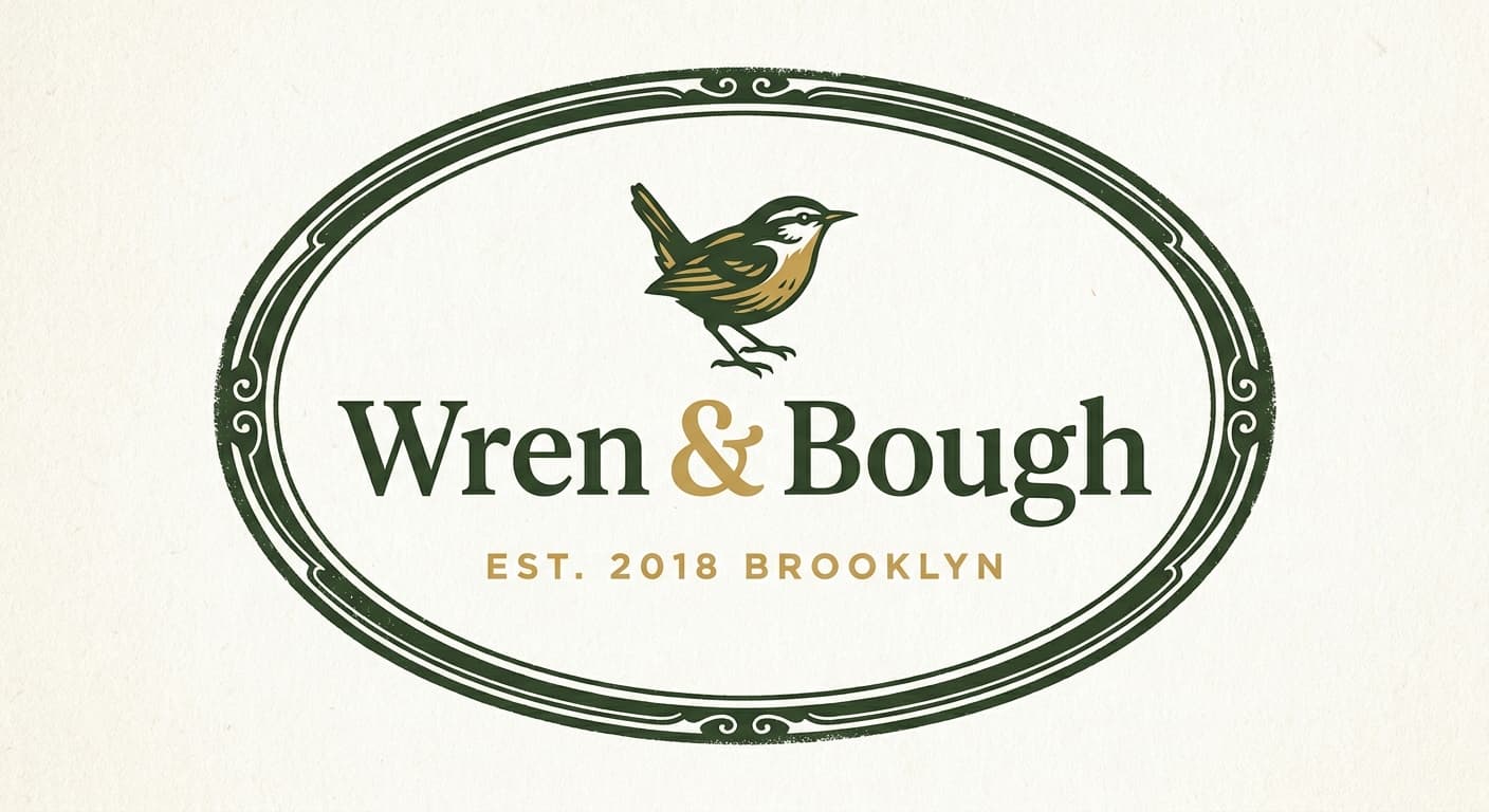
4 variants across the architectures.
Each variant takes a different position on architecture or register so the brand owner can see the choice clearly. The variants below would constitute the presentation set for review.

Application contexts
The mark in five application contexts.
A mark that does not survive its application contexts is not a contender. The renders below show the primary variant against each of the five surfaces this brand has to ship on.
Glass jar label
Retail shelf, viewed at arm's length under store lighting.
Olive oil bottle

Slim label format wrapping curved glass.
Retail shelf strip
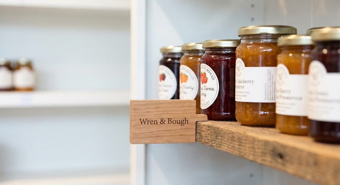
Specialty grocery shelf-edge marker.
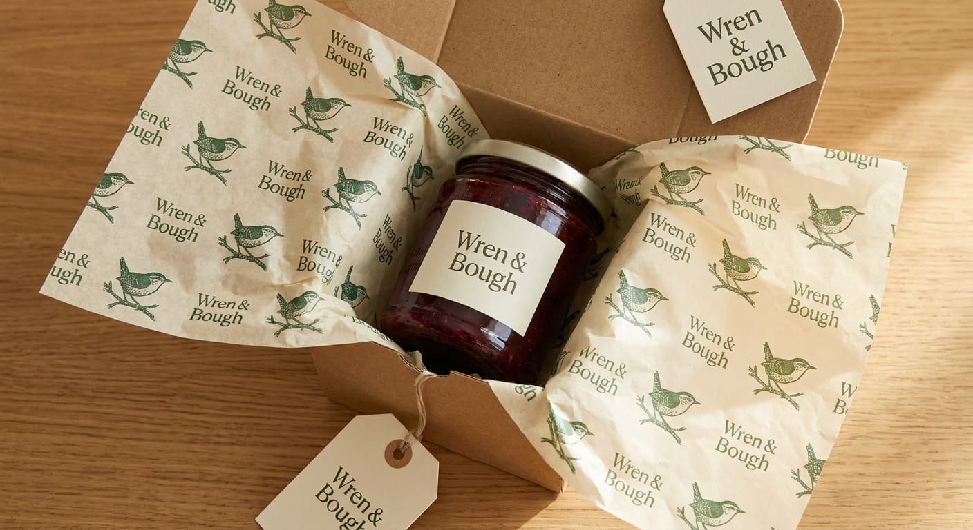
tissue-paper-packaging
Favicon · 32px

Browser tab at retina favicon size. Subtle letterform detail can survive here.
The deliverable
One variant, the nine-field spec.
This is the format the logo-design skill produces for every variant in a presentation set. The brand owner reads the spec, the mockup notes, the signals and rejects, and decides on the architecture before the production refinement begins.
Continue