Logo Design Showcase · Financial services
Morgan Northrop
Institutional advisors since 1987.
A boutique investment advisory firm serving family offices and institutional accounts. The brand needs a mark with institutional gravity and heritage signaling, without falling into the generic-financial-blue pattern.
The brief
Morgan Northrop competes on heritage and judgment rather than volume. Clients are family offices and small institutions making allocation decisions over decades, not quarters. The mark has to survive on foil-stamped business cards at boutique-stationer fidelity, on letterhead at desk-reading distance, on engraved office signage that gets read by visitors before they meet anyone, on an annual report cover printed in three colors plus one foil pass, and at favicon scale on the client portal. Cliches to avoid: royal blue plus a generic up-and-to-the-right arrow, the shield-with-a-letter that every wealth manager defaults to, and the photograph of a column that says nothing about the firm.
Primary mark
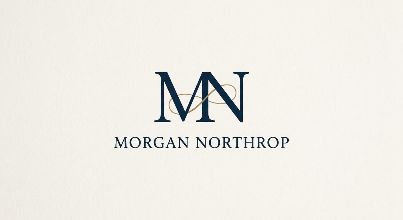
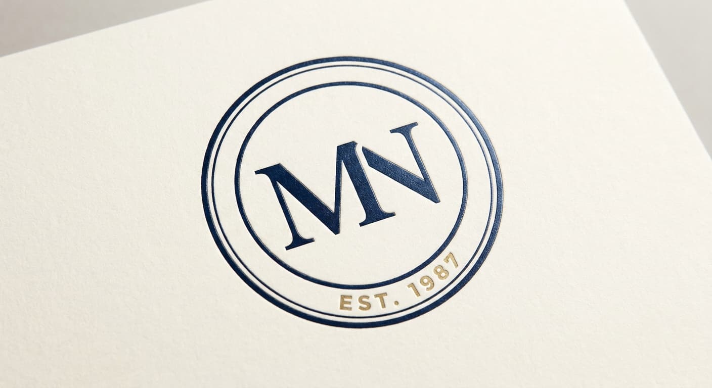
Monogram in Transitional serif
The monogram approach is the heritage register for advisory firms with founding-partner names. The MN ligature in a custom transitional-serif treatment carries gravity at any scale, foil-stamps cleanly because the negative space is held in confident proportions, and reads at 32px without the wordmark needing to follow. Reference: Brunello Cucinelli, J.P. Morgan archival marks, Tiffany & Co. The treatment is not a blackletter monogram; it is a refined serif construction with subtle bracket detail at the M apex.
Reference: Brunello Cucinelli, J.P. Morgan archival marks, Tiffany & Co., Yale University Press
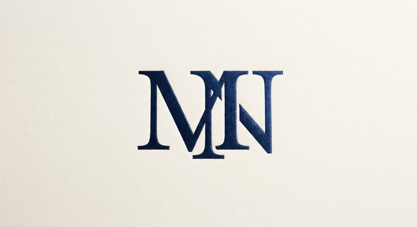
Variant exploration
4 variants across the architectures.
Each variant takes a different position on architecture or register so the brand owner can see the choice clearly. The variants below would constitute the presentation set for review.
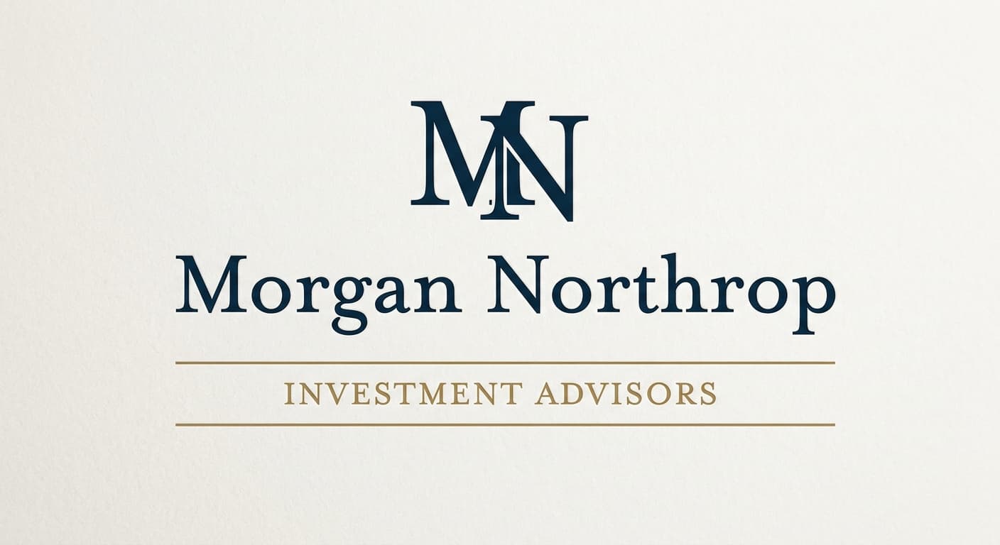
Application contexts
The mark in five application contexts.
A mark that does not survive its application contexts is not a contender. The renders below show the primary variant against each of the five surfaces this brand has to ship on.
Foil-stamped business card
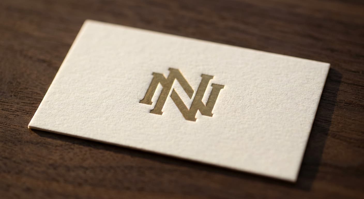
Boutique-stationer fidelity. The mark holds at quarter-inch scale.
Letterhead
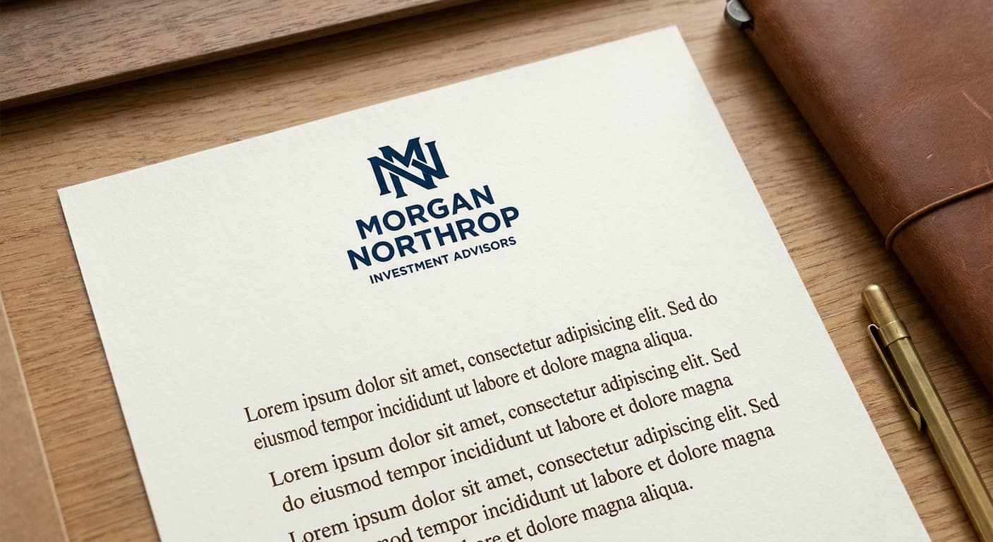
Full lockup at desk-reading distance, paired with body text.
Engraved office signage
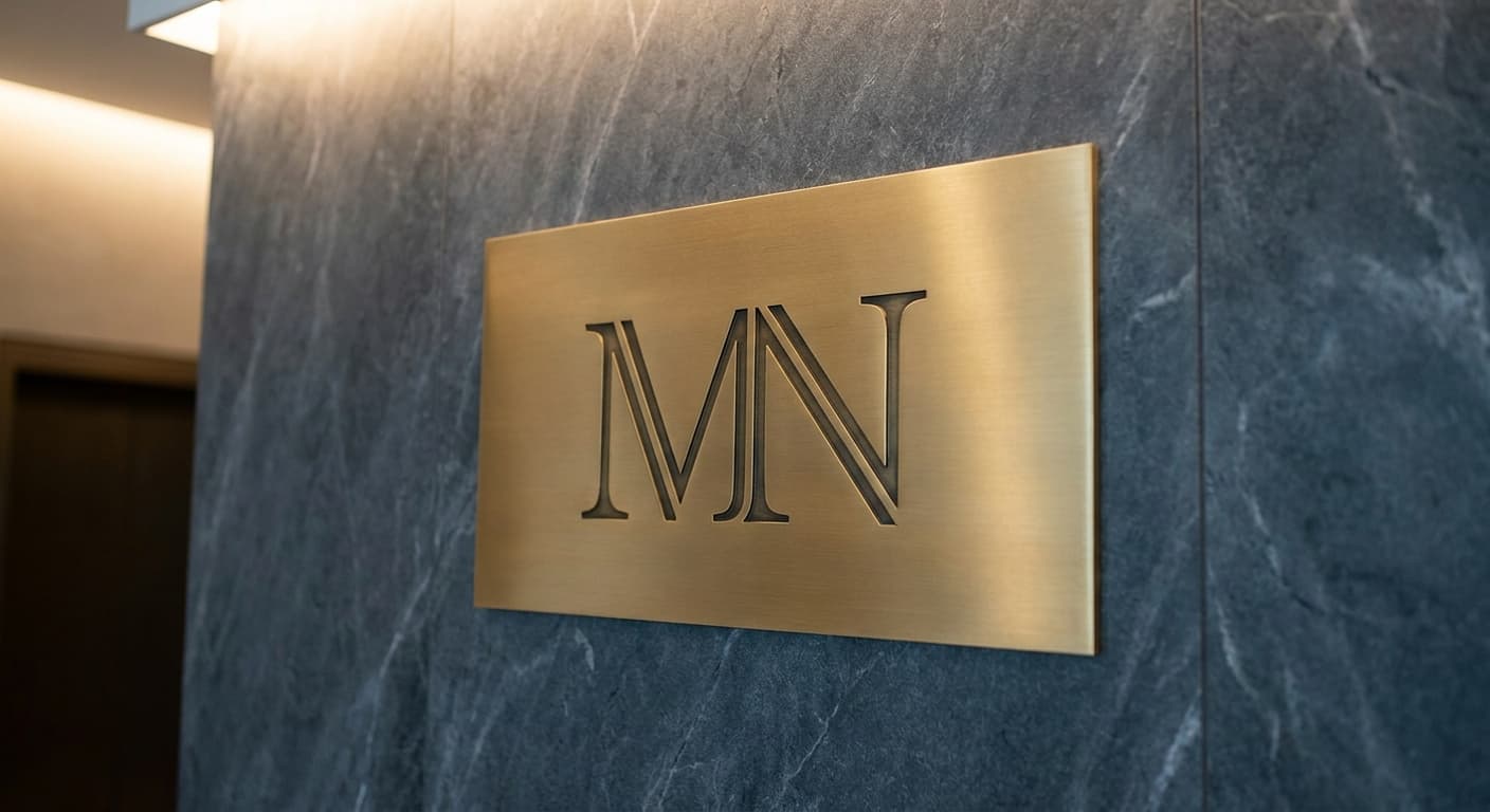
Visitor-facing signage that gets read before the meeting.
Annual report cover
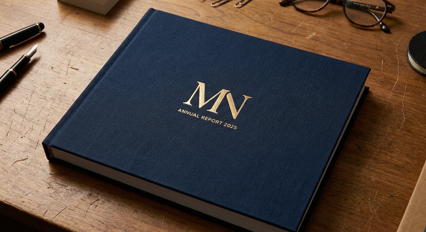
Three-color print plus one foil pass.
Favicon · 32px

Browser tab at retina favicon size. Subtle letterform detail can survive here.
The deliverable
One variant, the nine-field spec.
This is the format the logo-design skill produces for every variant in a presentation set. The brand owner reads the spec, the mockup notes, the signals and rejects, and decides on the architecture before the production refinement begins.
Continue