Logo Design Showcase · Craft / artisan
Atlas Coffee
Single-origin coffee, considered roasting.
A specialty coffee roaster with retail bag distribution, four cafe locations, and a direct-to-consumer subscription. The brand needs a mark that reads as craft without rusticity, with outdoor adjacency without literal coffee-bean iconography.
The brief
Atlas Coffee occupies the considered end of specialty coffee. The audience is the customer who buys coffee by origin and roast date and reads the postcard inside the bag. The mark has to survive on a kraft-paper retail bag printed in two colors, on a half-inch espresso cup stamp, on storefront signage at street scale, and on apron embroidery in two thread weights. Cliches to avoid: the coffee bean iconography that everyone in the category uses, the rope-bordered seal that signals rustic but says nothing, and the hand-drawn mountain illustration that fights for legibility on kraft paper. The mark should read as craft from the type construction itself, not from manufactured weathering.
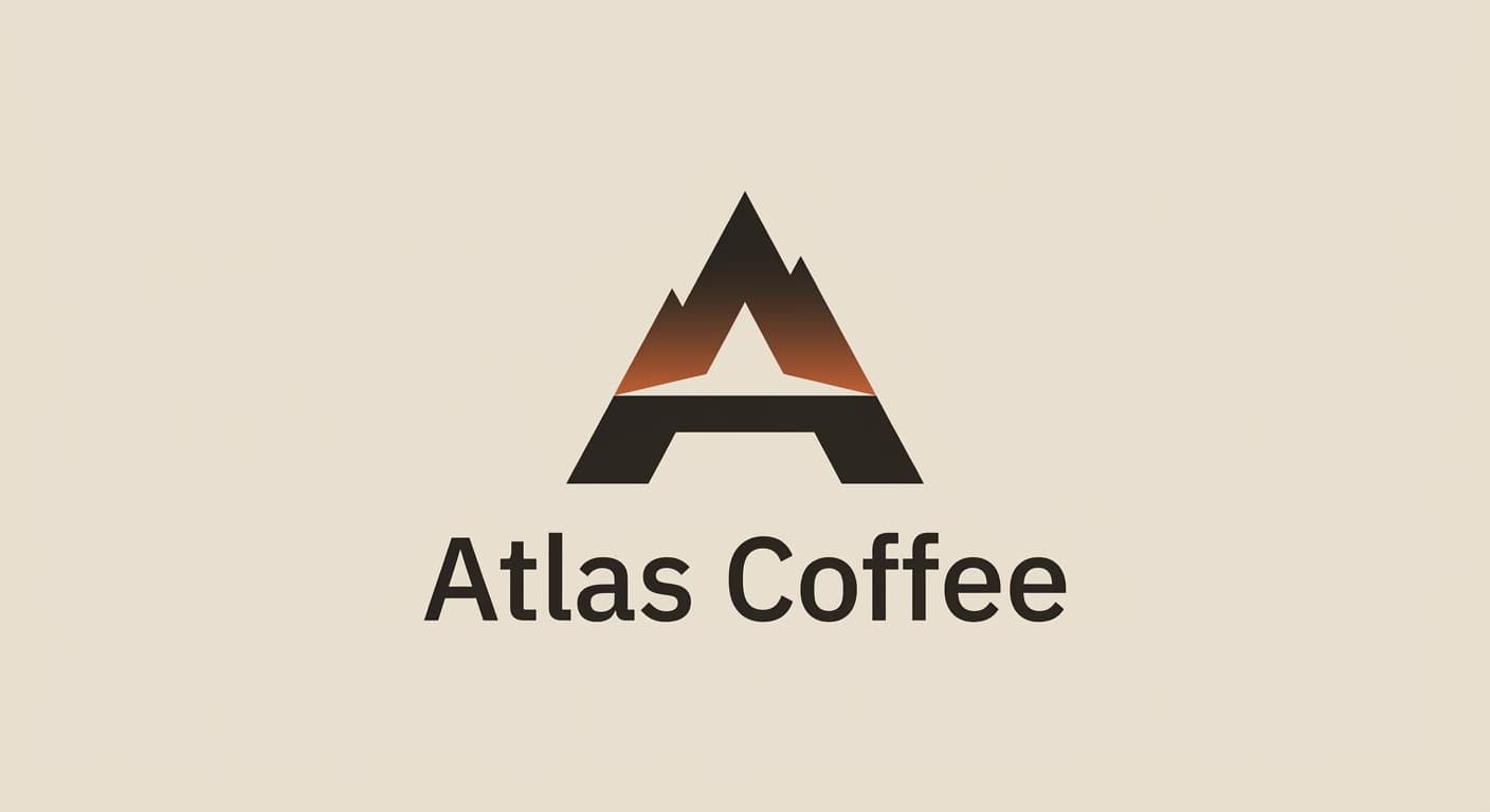
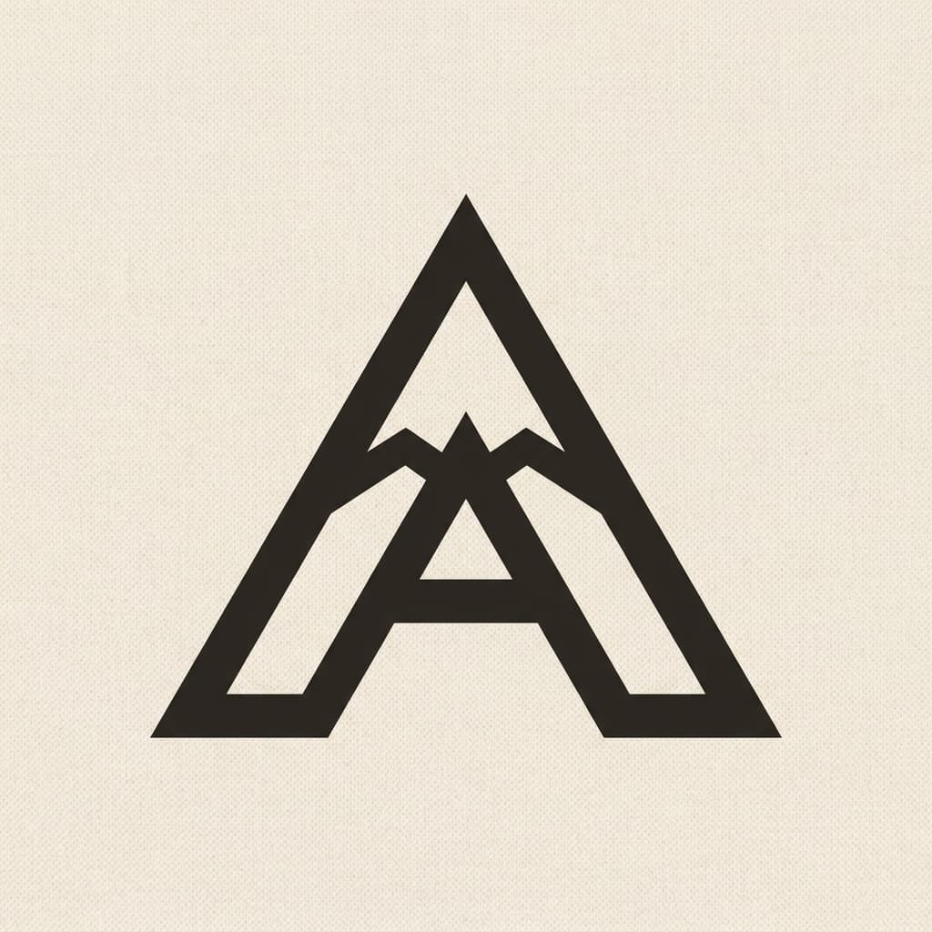
Primary mark
Letterform as symbol in Geometric sans
The capital A is the natural mountain peak, and the brand name leads with it. Treating the A as the mark removes the wordmark-plus-symbol redundancy that plagues the category and gives the brand a single recognizable form. Reference: Yosemite Park Co., Ace Hotel, Lyft. Geometric sans construction reads modern without tipping into tech; the A apex is sharpened to read as summit rather than just a letter.
Reference: Yosemite Park Co., Ace Hotel, Lyft, Stumptown
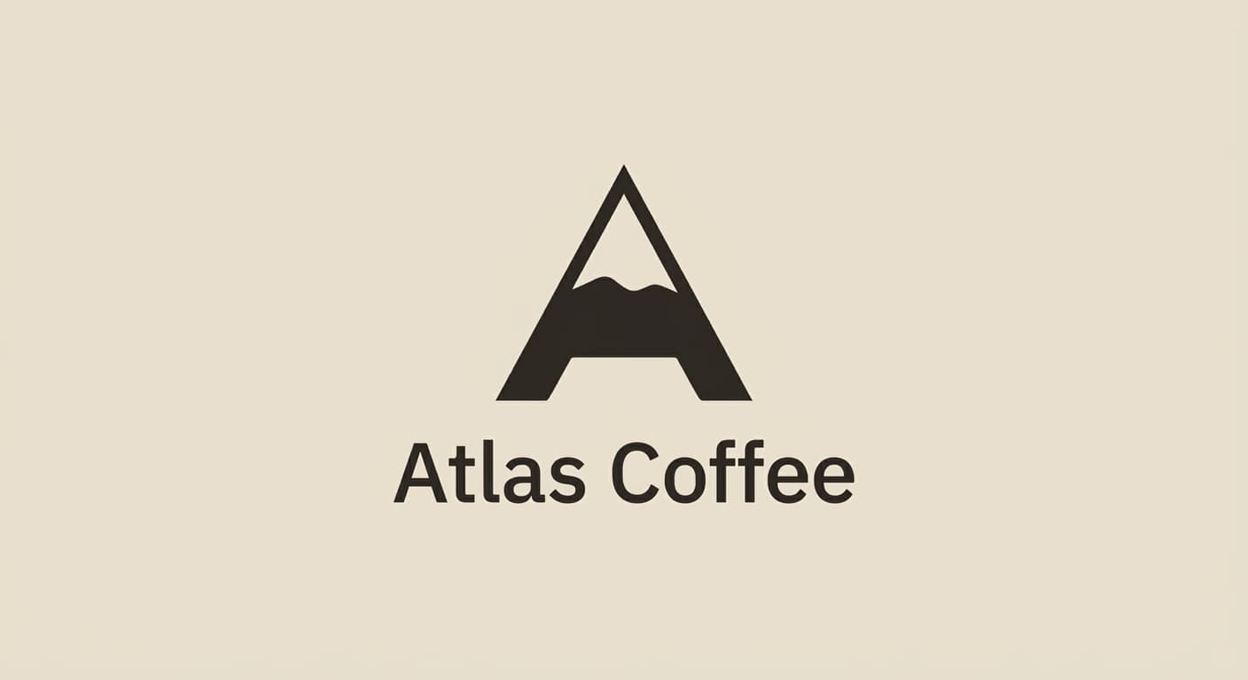
Variant exploration
4 variants across the architectures.
Each variant takes a different position on architecture or register so the brand owner can see the choice clearly. The variants below would constitute the presentation set for review.
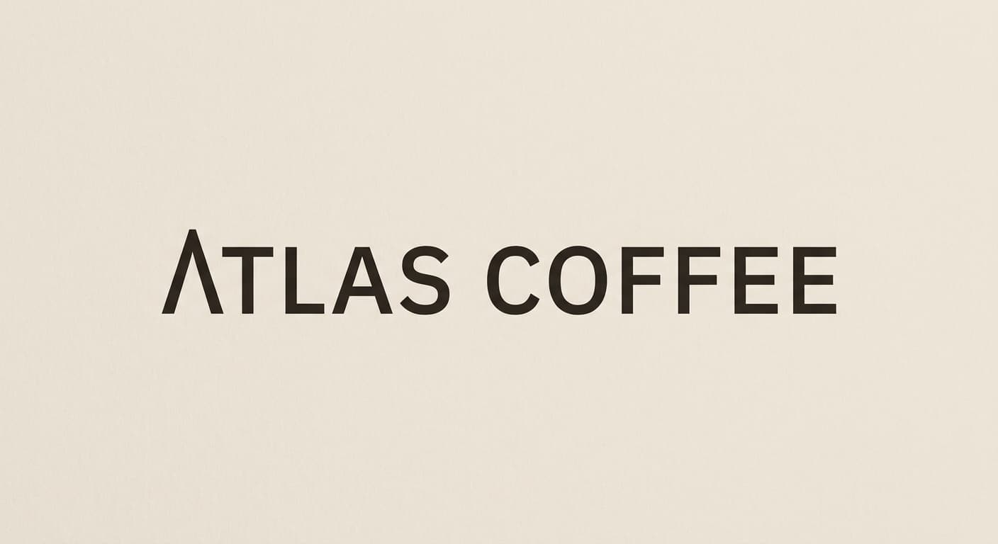
Application contexts
The mark in five application contexts.
A mark that does not survive its application contexts is not a contender. The renders below show the primary variant against each of the five surfaces this brand has to ship on.
Favicon · 16px

Browser tab at actual size. The mark must read at 16x16 pixels.
Retail bag, two-color print
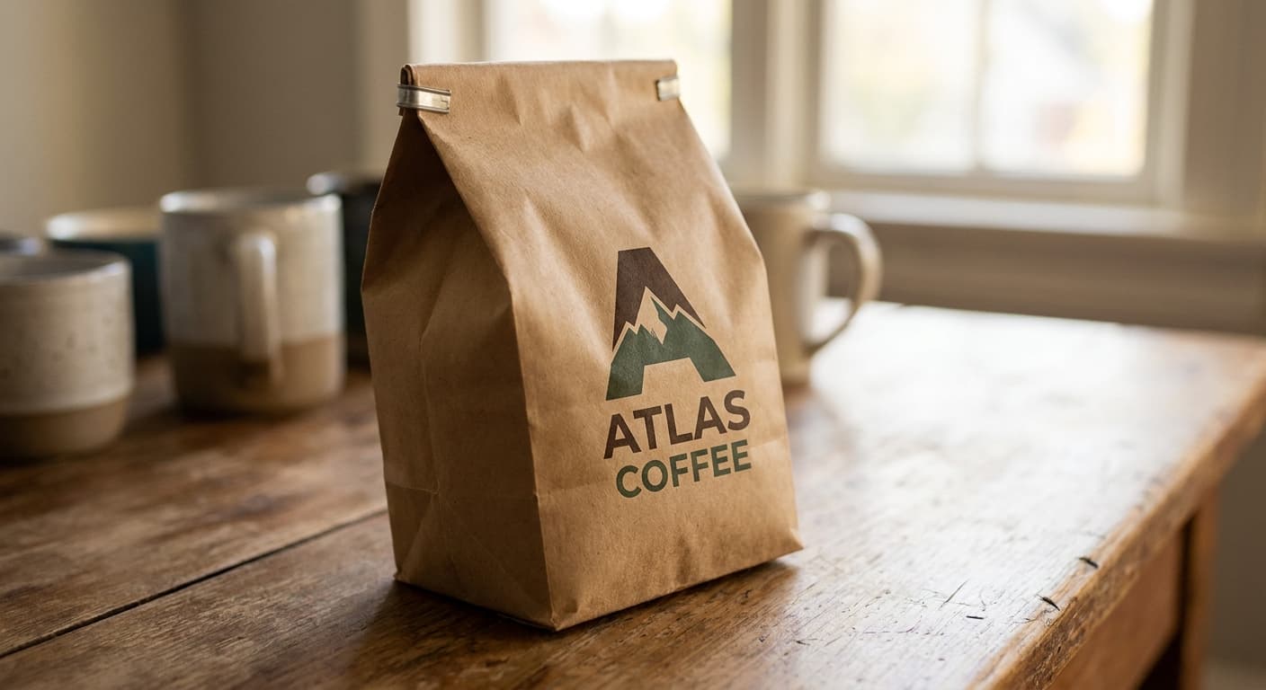
Kraft-paper coffee bag, primary plus accent ink only.
Espresso cup stamp
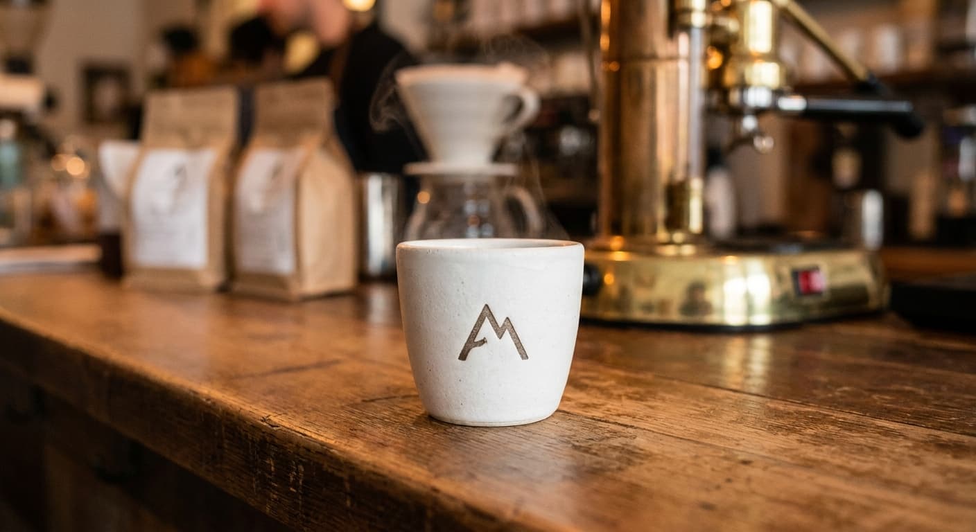
Single-color stamp at half-inch diameter.
Storefront signage
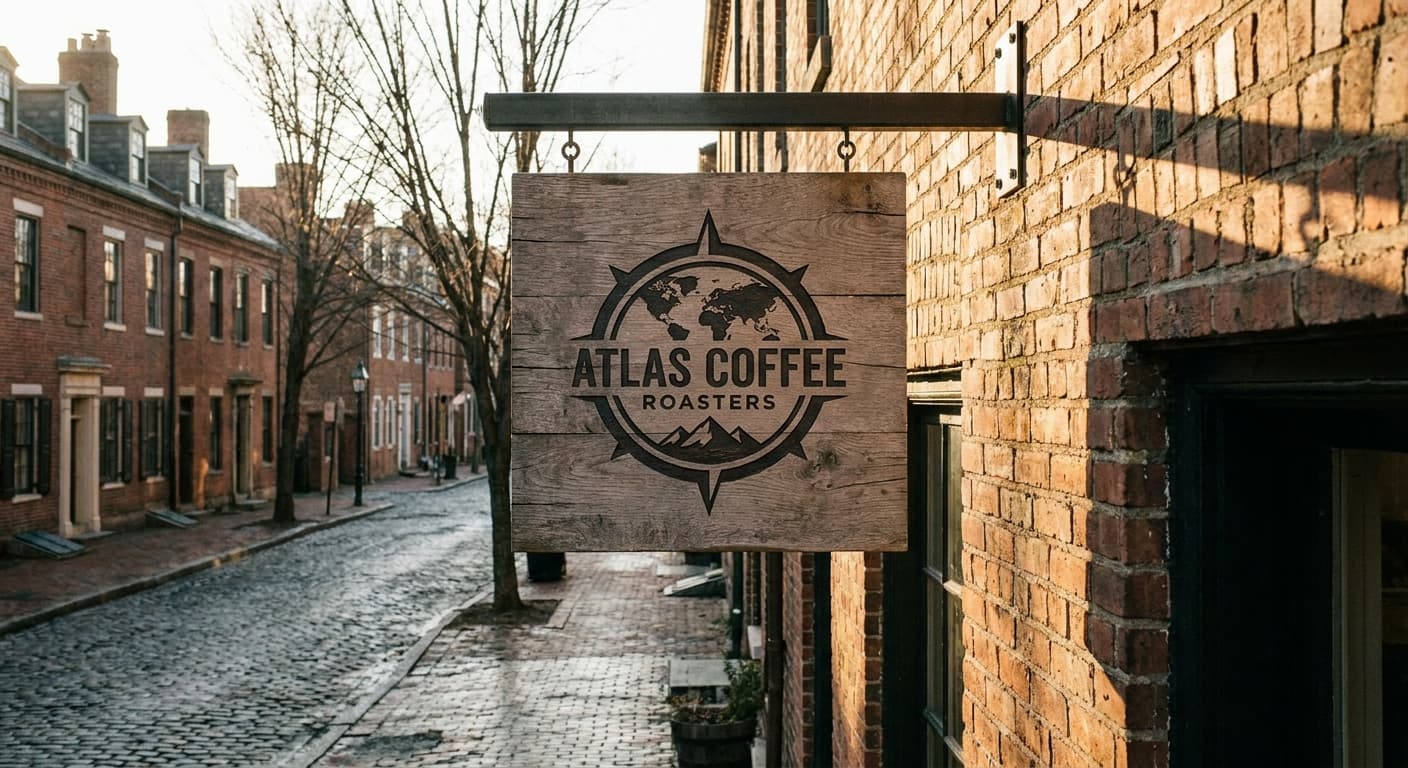
Cafe exterior at street scale. The mark anchors the elevation.
Apron embroidery
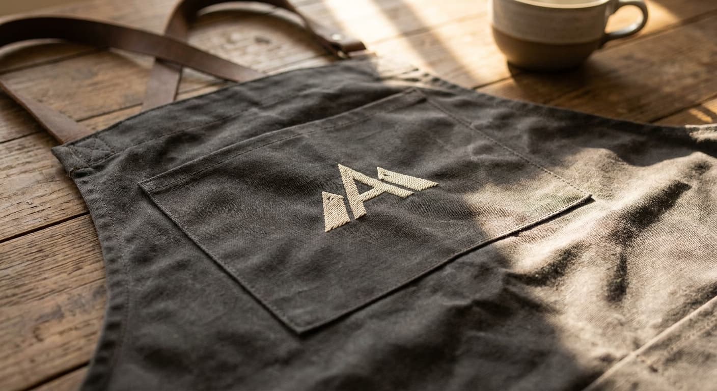
Four-color stitch maximum on canvas weave.
The deliverable
One variant, the nine-field spec.
This is the format the logo-design skill produces for every variant in a presentation set. The brand owner reads the spec, the mockup notes, the signals and rejects, and decides on the architecture before the production refinement begins.
Continue