Logo Design Showcase · Legal
Whitfield Carter
Counsel for institutional clients.
A boutique litigation firm representing institutional clients in complex commercial disputes. Founded in 1973, with offices in Chicago and Washington. The brand needs institutional gravity and heritage signaling, restraint at small reproduction sizes for court filings, and a treatment that distinguishes from the generic blue-shield convention common to legal branding.
The brief
Whitfield Carter argues complex commercial cases for institutional clients. The audience is the general counsel deciding which firm gets the bet-the-company matter. The mark has to survive on engraved brass plaques mounted in marble lobbies, on foil-stamped letterhead at desk-reading distance, on the footer of court filings printed in single color, and at favicon scale on the client portal. Cliches to avoid: the generic legal blue plus a scales-of-justice icon, the Greek column photographed in flat museum lighting, and the shield-with-sans-serif-letters that signals corporate-bank trust rather than litigation discipline.
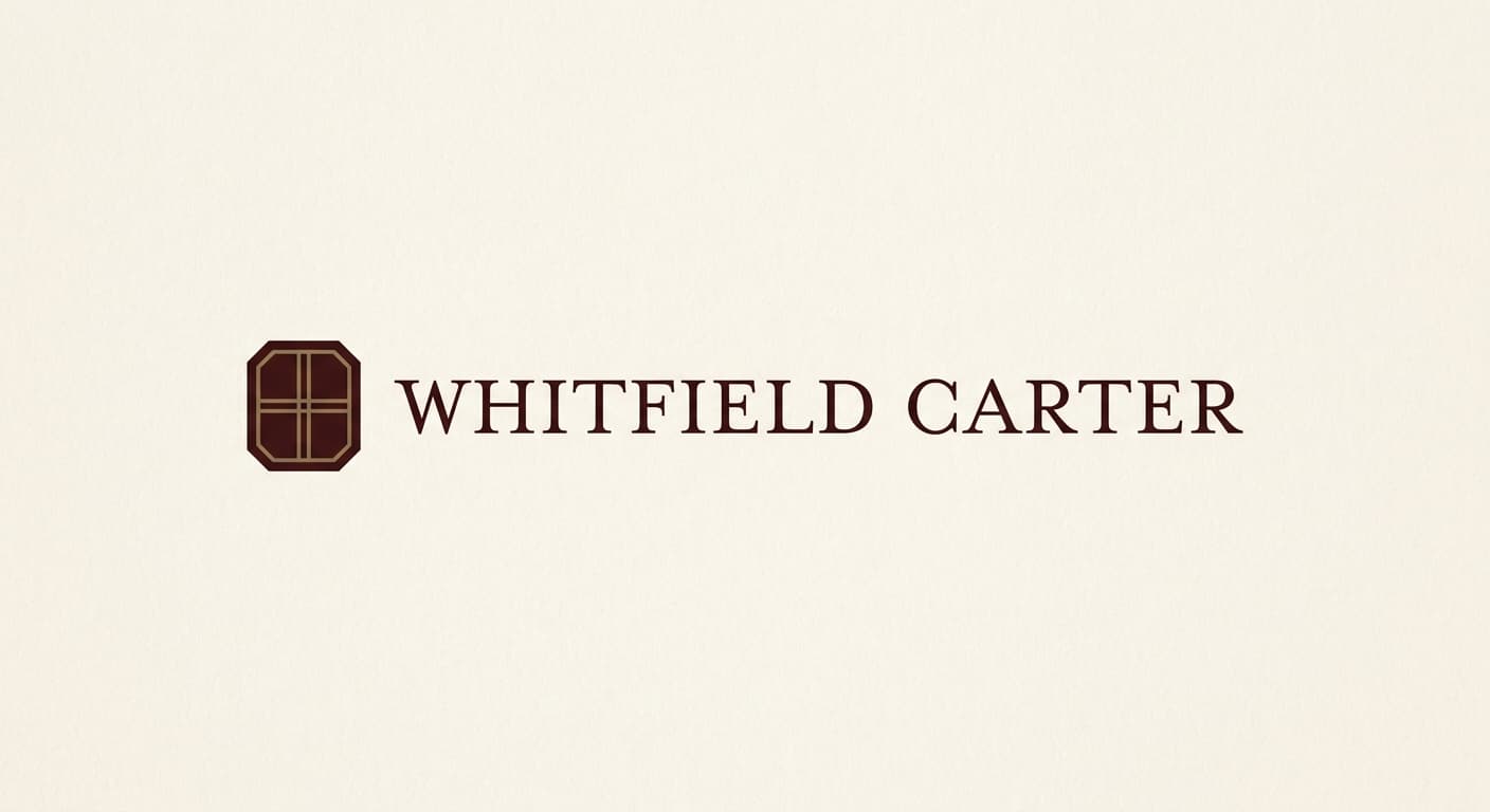
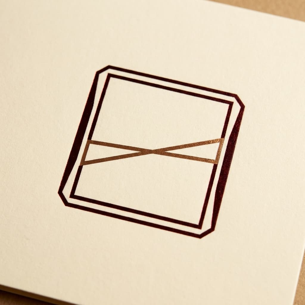
Primary mark
Lockup in Old-style serif
A small geometric seal beside an old-style serif wordmark carries institutional gravity without slipping into staidness. The seal is reductive, two horizontal rules inside a chamfered rectangle, evoking institutional document headers without literal scales-of-justice or column motifs. Reference: Wachtell Lipton, Sullivan & Cromwell typographic treatments. Mrs Eaves Roman is the load-bearing typeface, with refined kerning that holds at court-filing-footer scale.
Reference: Wachtell Lipton, Sullivan & Cromwell, Cravath Swaine & Moore, Yale University Press
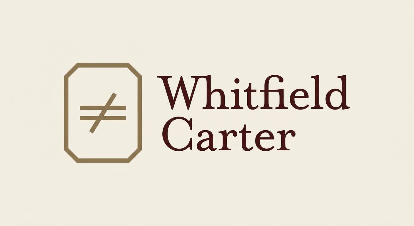
Variant exploration
4 variants across the architectures.
Each variant takes a different position on architecture or register so the brand owner can see the choice clearly. The variants below would constitute the presentation set for review.
Application contexts
The mark in five application contexts.
A mark that does not survive its application contexts is not a contender. The renders below show the primary variant against each of the five surfaces this brand has to ship on.
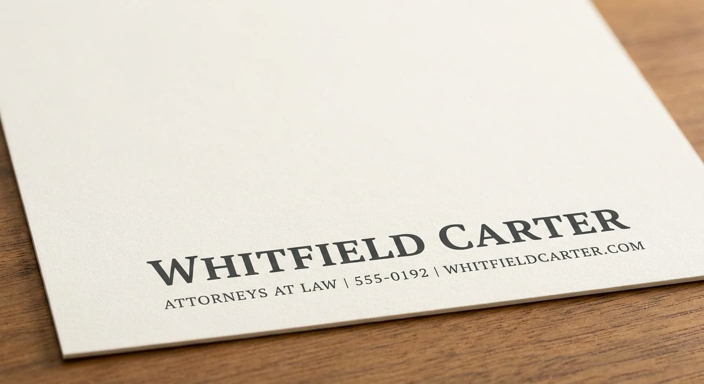
Engraved business card
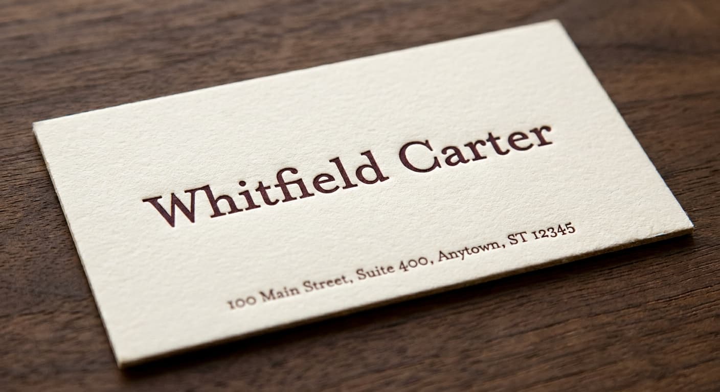
Boutique-stationer fidelity at quarter-inch scale.
Foil-stamped letterhead
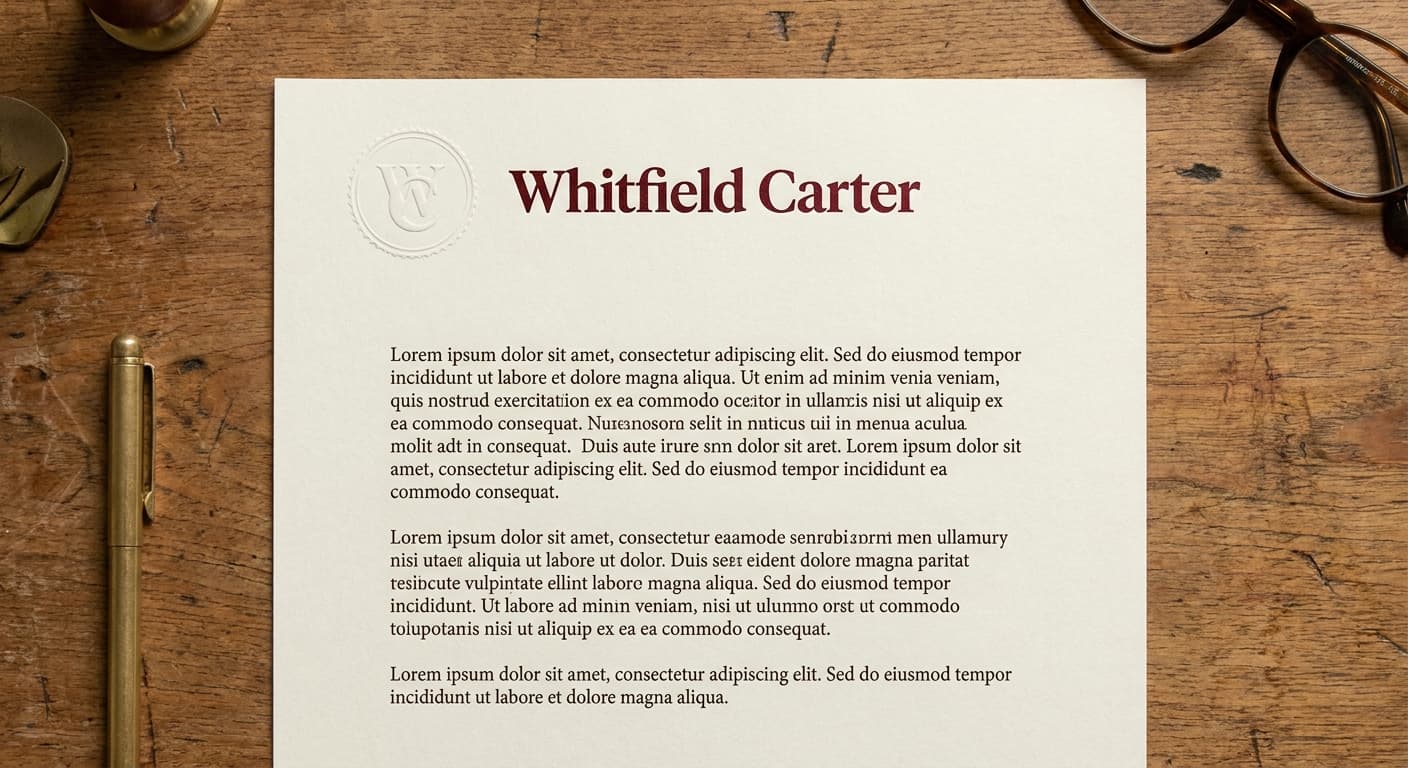
Cream cotton stock with foil mark at desk-reading distance.
Engraved office signage
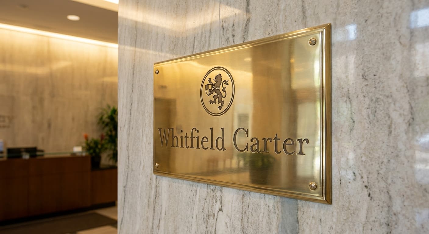
Visitor-facing signage that gets read before the meeting.
Court filing footer
Single-color reproduction at small print size on official documents.
Favicon · 32px

Browser tab at retina favicon size. Subtle letterform detail can survive here.
The deliverable
One variant, the nine-field spec.
This is the format the logo-design skill produces for every variant in a presentation set. The brand owner reads the spec, the mockup notes, the signals and rejects, and decides on the architecture before the production refinement begins.
Continue