Logo Design Showcase · Craft / artisan
Tilth
Hand-thrown ceramics from Mendocino.
An artisan ceramics studio producing hand-thrown stoneware vessels and dinnerware in small batches. Studio in coastal Mendocino, sells through gallery shows and direct-to-collector. The brand needs craft credibility without rusticity.
The brief
Tilth is the studio whose pieces sit in the homes of customers who keep a list of makers they collect. The mark has to impression-stamp on the underside of pottery in single color, hold on a carved studio sign, sit on tissue paper packaging for shipping, on a letterpress hangtag, and at favicon scale. Cliches to avoid: the hand-lettered Etsy-craft default, the literal plant-and-leaf illustration, the rough-and-rustic typography that signals farmstand pottery.
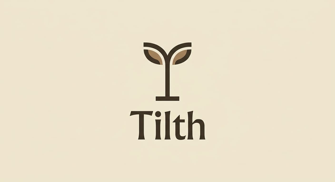
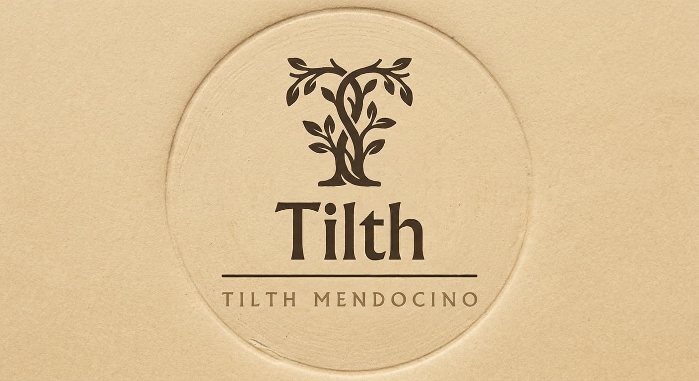
Primary mark
Letterform as symbol in Humanist sans
A custom T character treated as a sprouting branch (the crossbar gives rise to two short upward strokes, the vertical stem grounds the form) paired with the wordmark Tilth in Albertus Pro. Distinct from Atlas Coffee's letterform-as-symbol approach (which is the A-as-mountain) by the organic branch construction versus the geometric peak. Reference: Heath Ceramics, Yves Behar studio typographic treatments.
Reference: Heath Ceramics, Yves Behar, BDDW, Hawkins New York
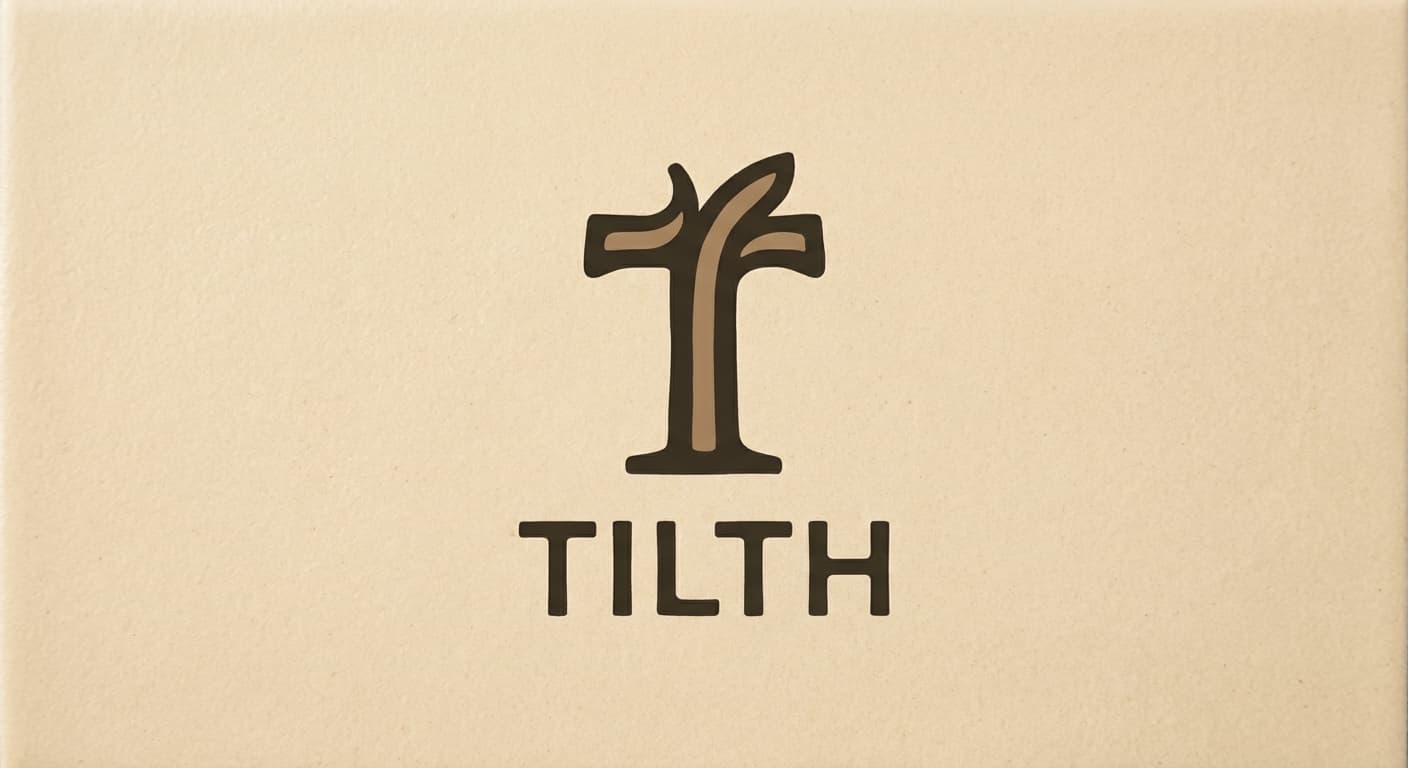
Variant exploration
4 variants across the architectures.
Each variant takes a different position on architecture or register so the brand owner can see the choice clearly. The variants below would constitute the presentation set for review.
Application contexts
The mark in five application contexts.
A mark that does not survive its application contexts is not a contender. The renders below show the primary variant against each of the five surfaces this brand has to ship on.
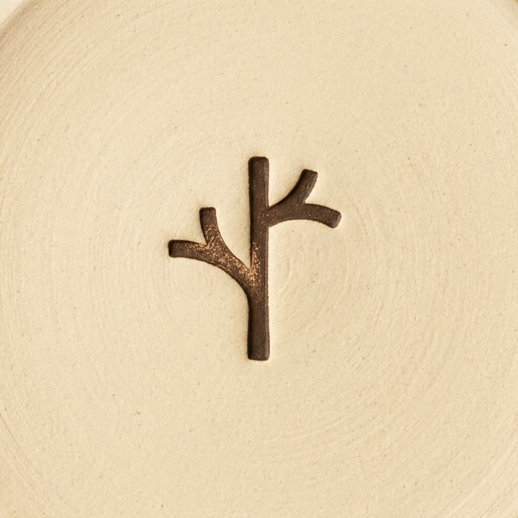
Pottery base stamp
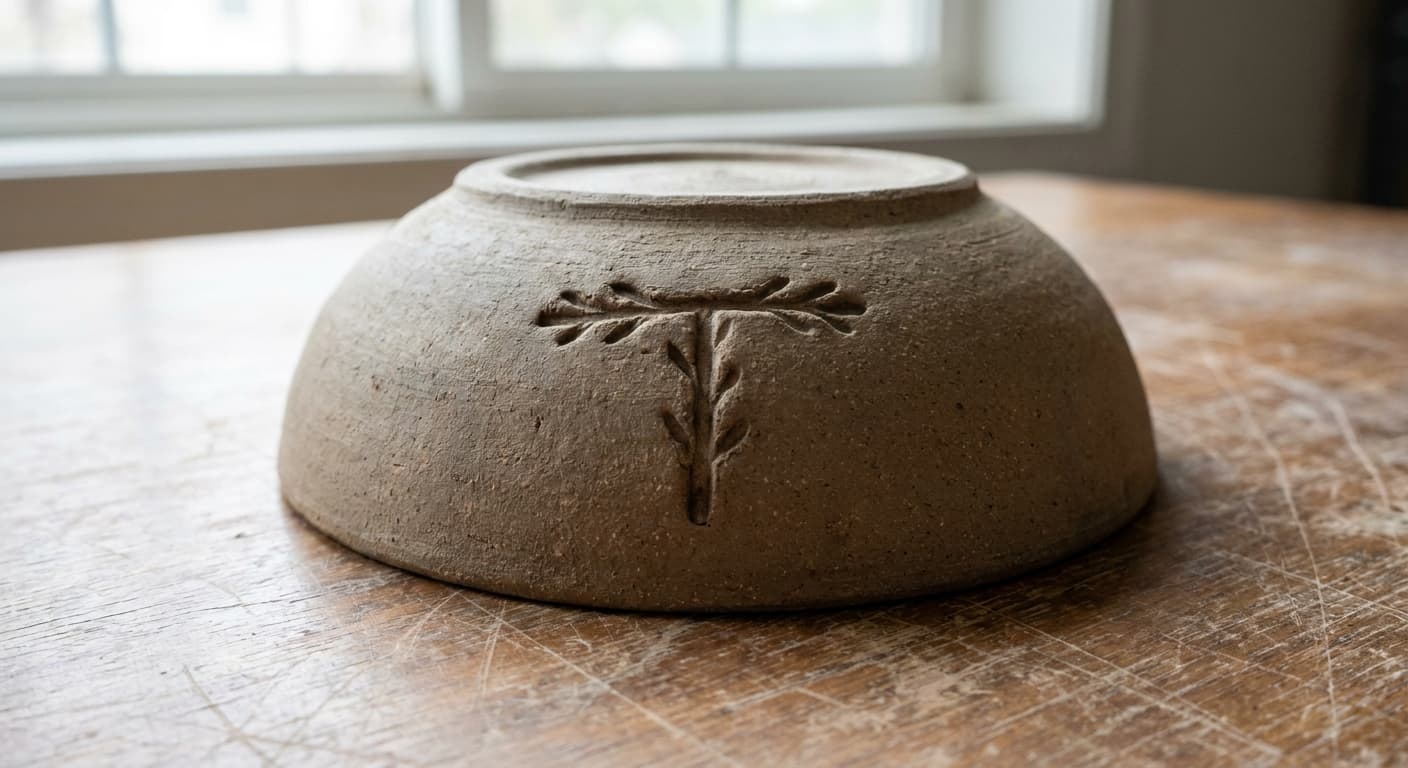
Impression on the underside of stoneware at single color.
Studio sign, carved
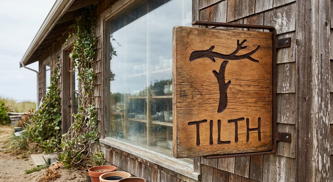
Wood signage outside the studio at arrival-distance.
tissue-paper-packaging
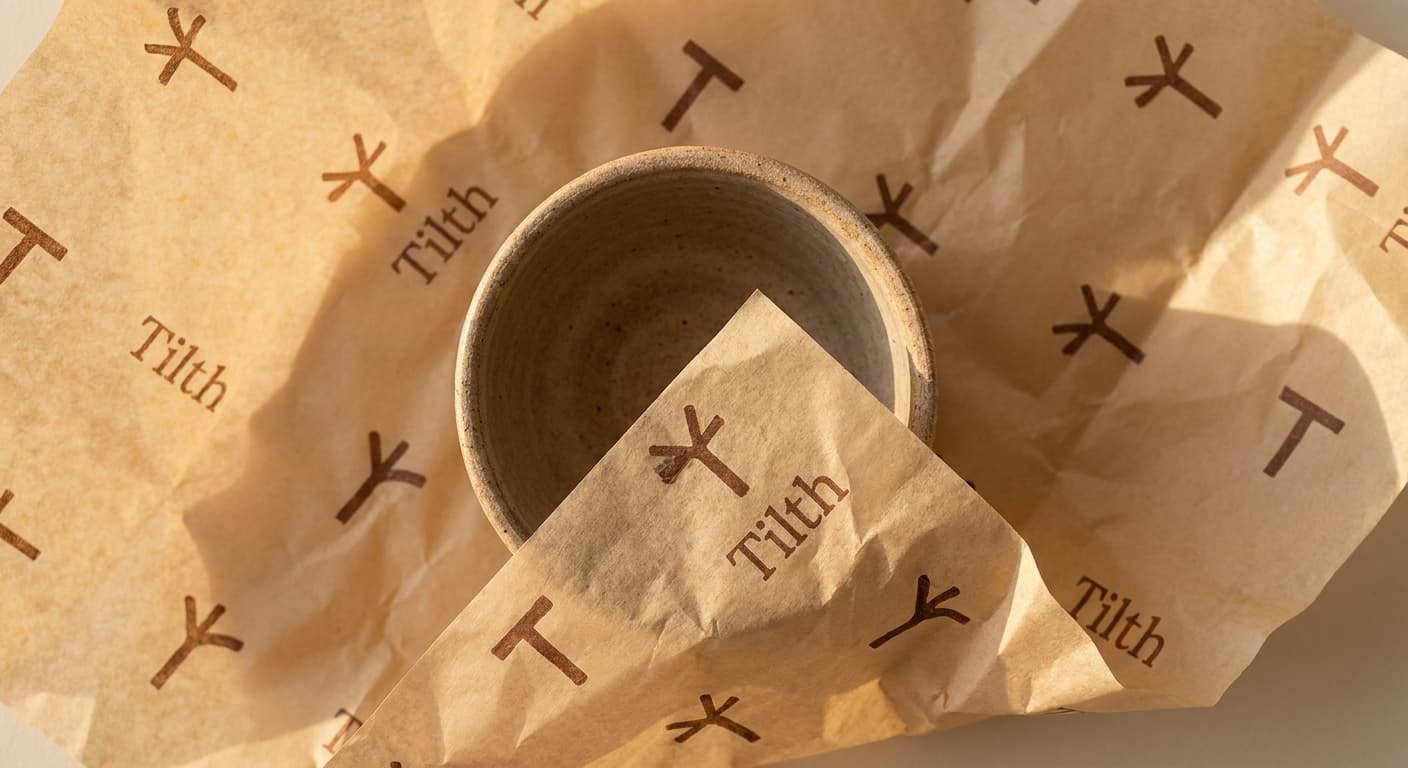
Letterpress hangtag
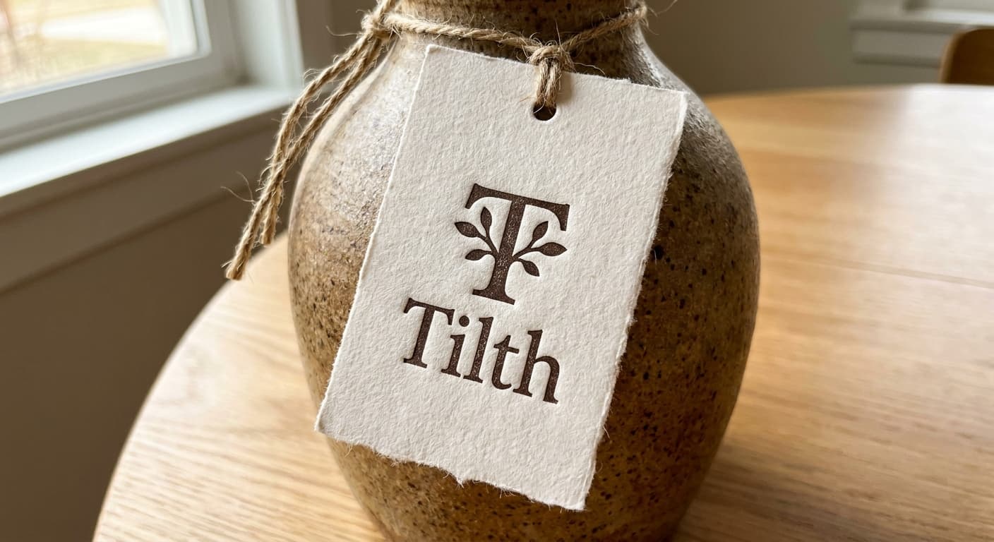
Cotton paper tag at gift-wrap fidelity.
Favicon · 32px

Browser tab at retina favicon size. Subtle letterform detail can survive here.
The deliverable
One variant, the nine-field spec.
This is the format the logo-design skill produces for every variant in a presentation set. The brand owner reads the spec, the mockup notes, the signals and rejects, and decides on the architecture before the production refinement begins.
Continue