Logo Design Showcase · Restaurant
Roost
Farm-to-table, on the corner.
A neighborhood farm-to-table restaurant in a converted corner storefront. Seasonal menu rotation, Sunday brunch service, dinner-only weekdays. The brand needs warmth without rustic-farmhouse cliche.
The brief
Roost is the corner restaurant in the kind of urban neighborhood where customers know the cooks. The mark has to read on a hand-painted storefront window, on a menu card at small-print scale, on a cocktail napkin, on a matchbook cover, and at favicon scale. Cliches to avoid: the rustic-farmhouse aesthetic that signals food-blog rather than restaurant, the chalkboard-script storefront treatment, the naturalistic-bird illustration that drifts into ornithology textbook territory.
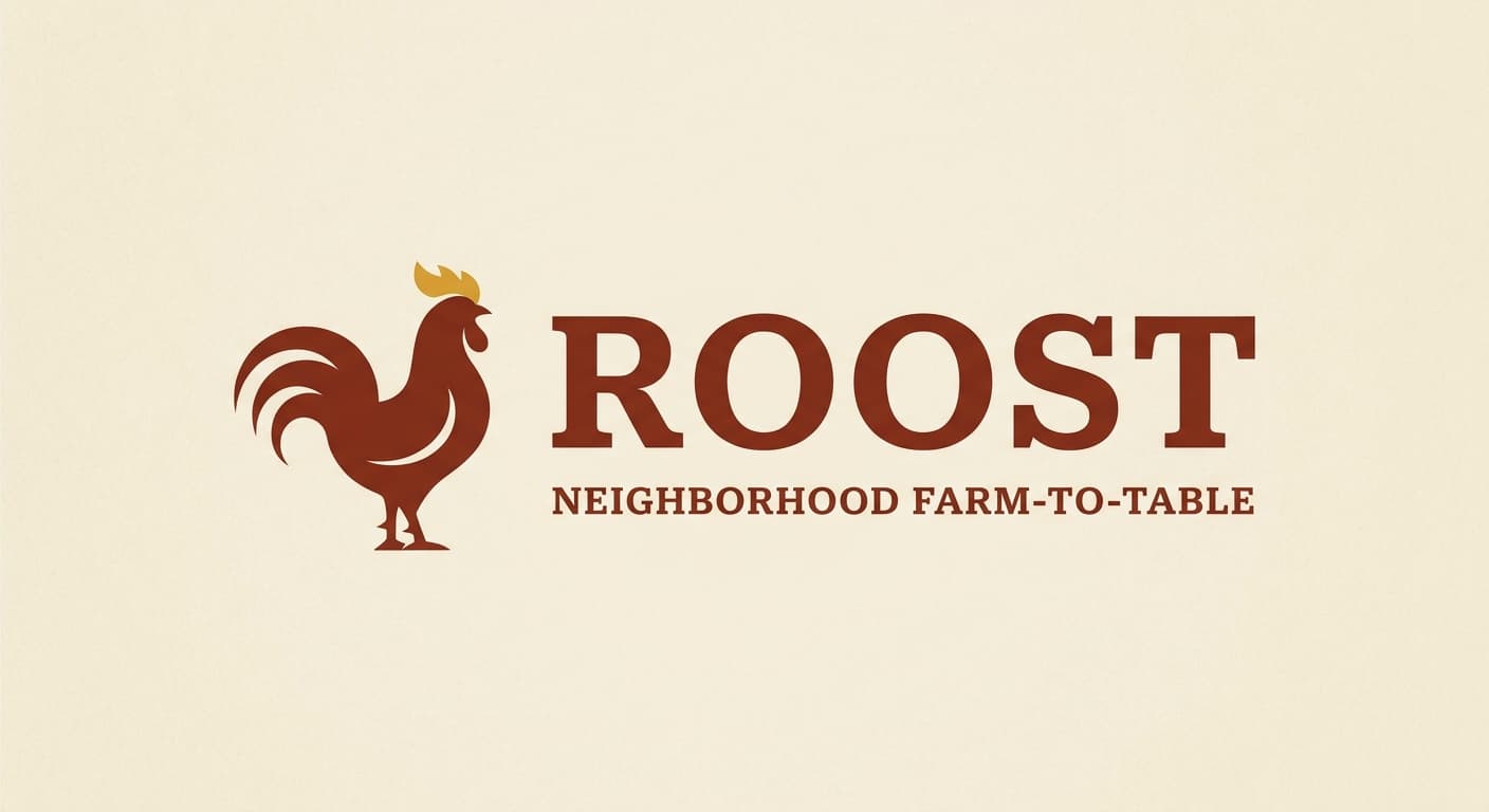
Primary mark
Lockup in Slab serif
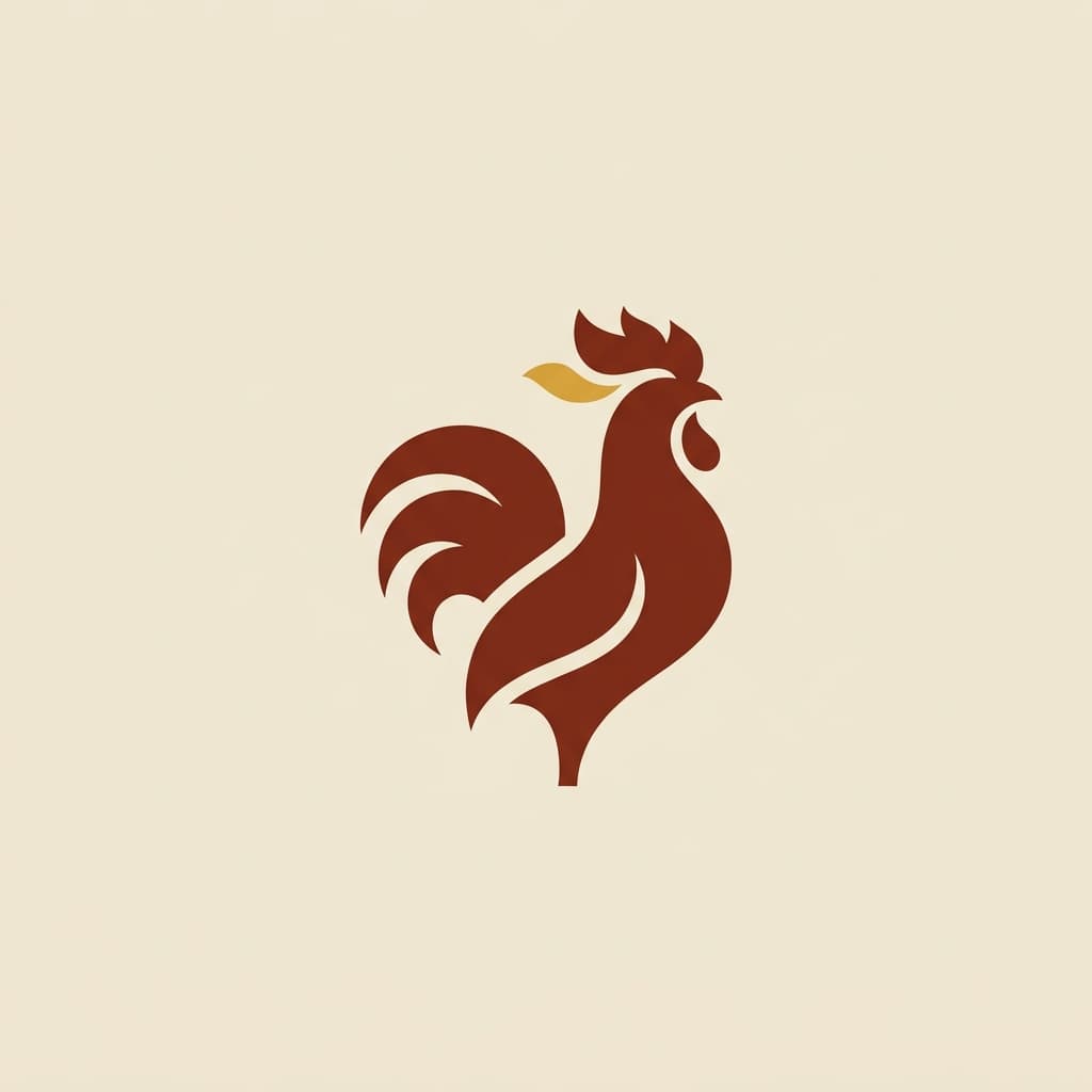
A stylized rooster silhouette beside the wordmark Roost in Whitman Display slab serif, with weight emphasis on the double-O. The rooster is rendered with confident curves and graphic restraint, not naturalistic illustration. Reference: Sqirl, Tartine, Husk Restaurant typographic treatments. Slab serif register reads warm without rustic.
Reference: Sqirl, Tartine, Husk Restaurant, Frenchette
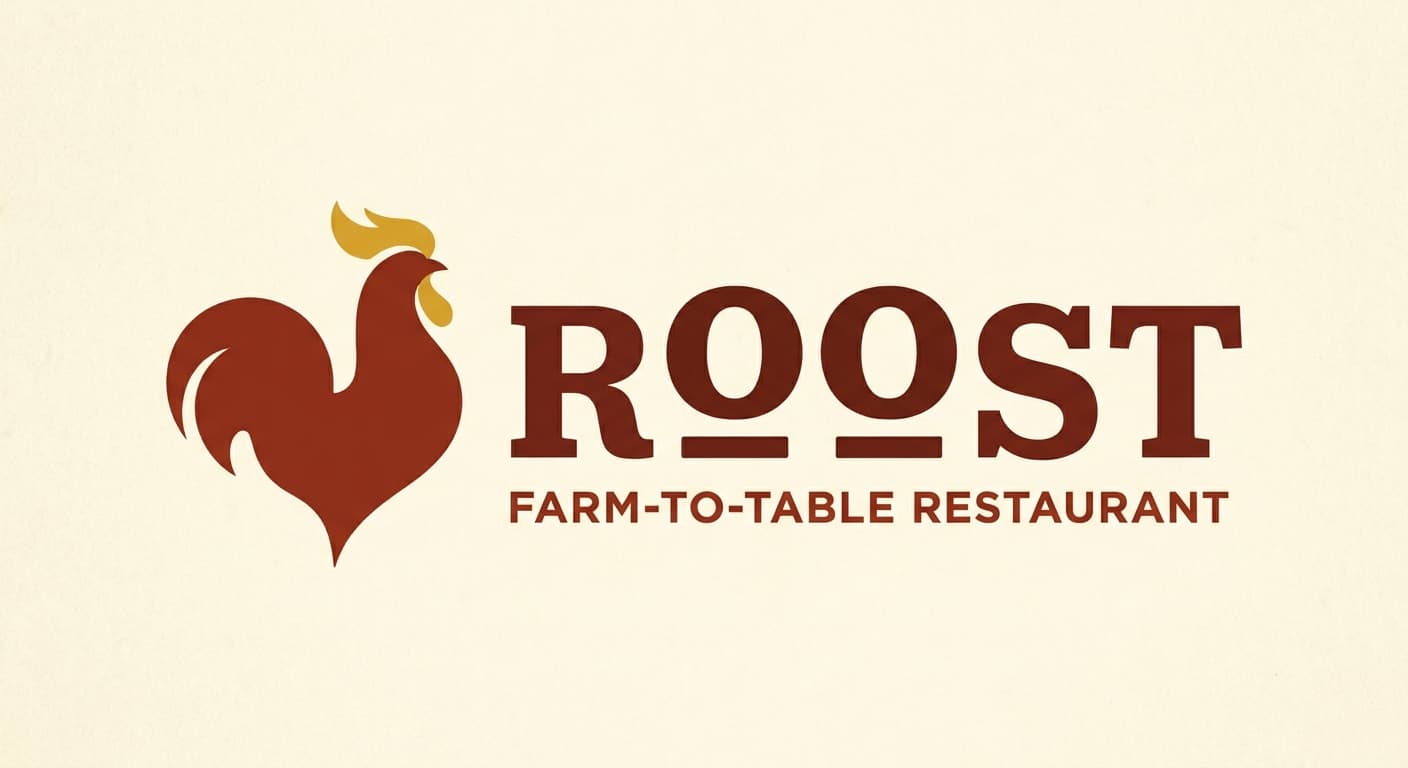
Variant exploration
4 variants across the architectures.
Each variant takes a different position on architecture or register so the brand owner can see the choice clearly. The variants below would constitute the presentation set for review.
Application contexts
The mark in five application contexts.
A mark that does not survive its application contexts is not a contender. The renders below show the primary variant against each of the five surfaces this brand has to ship on.
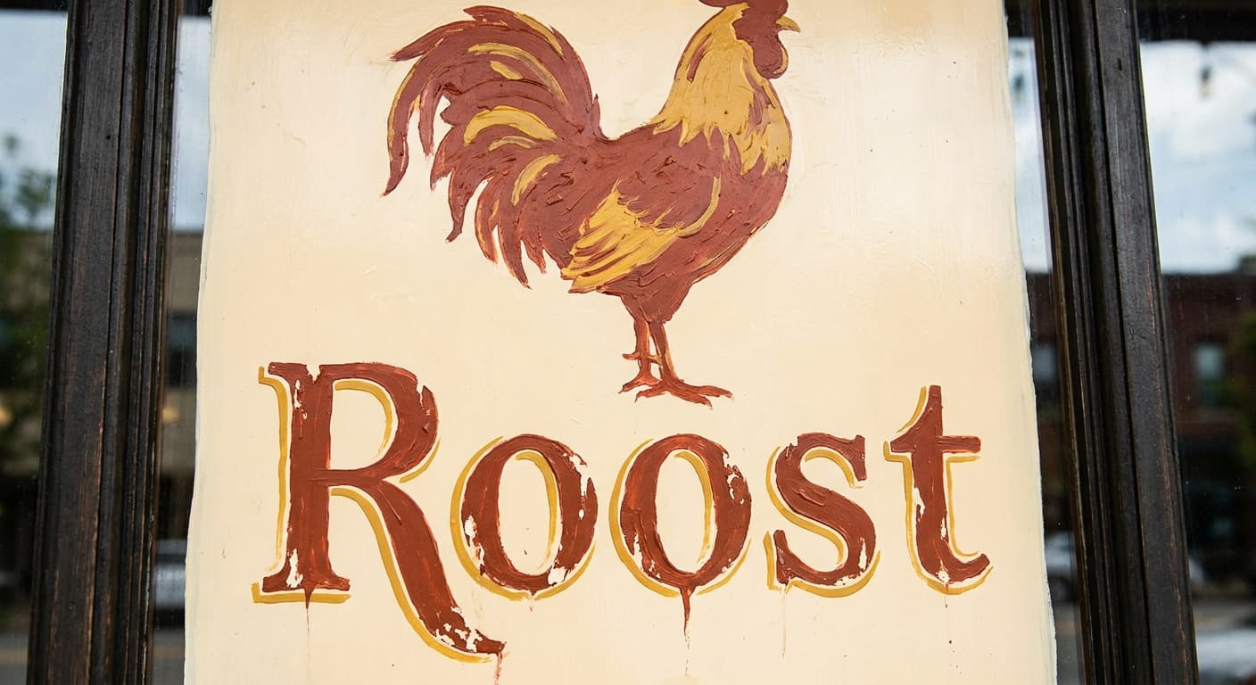
Window signage, hand-painted
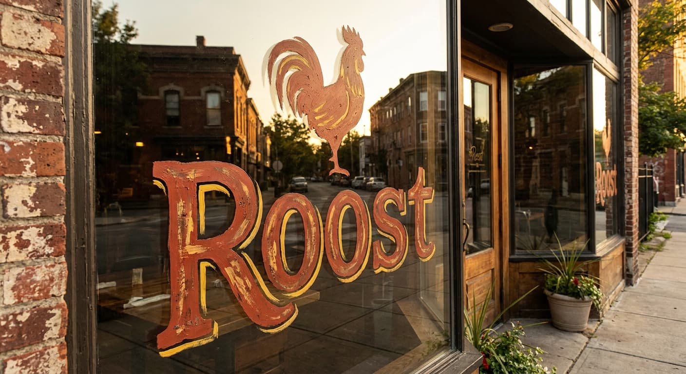
Storefront window at street scale, painterly treatment.
Menu card header
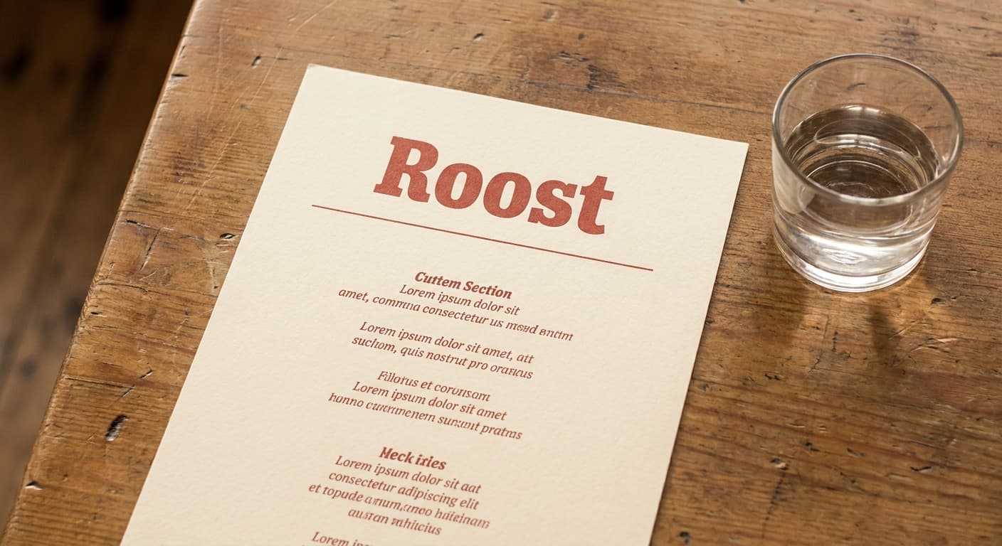
Tabletop menu at small-print scale.
Cocktail napkin
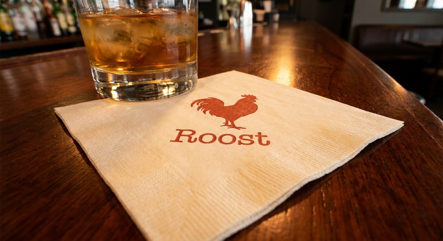
Single-color print on textured paper at small scale.
Matchbook cover
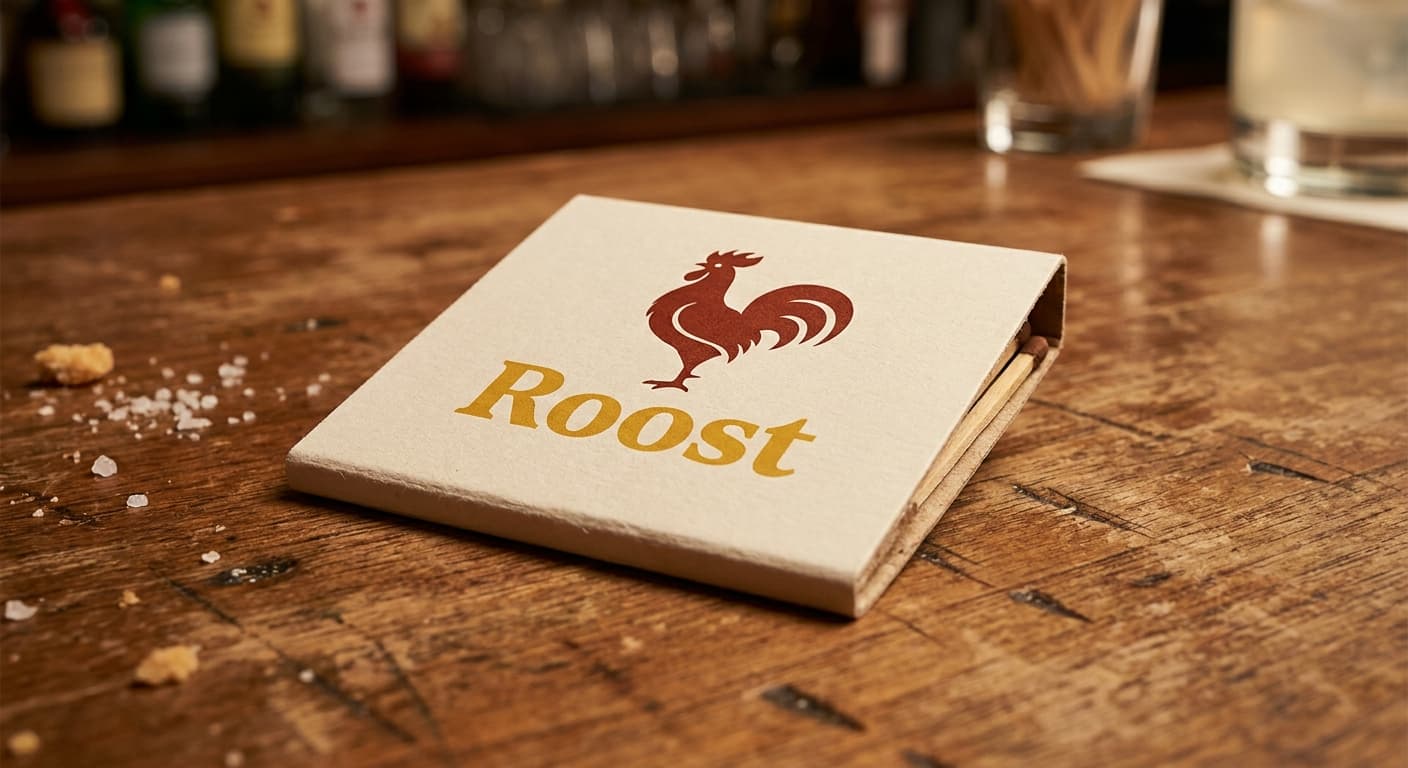
Two-color print on rolled cardstock at takeaway-size.
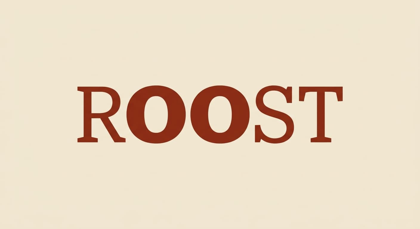
Favicon · 32px

Browser tab at retina favicon size. Subtle letterform detail can survive here.
The deliverable
One variant, the nine-field spec.
This is the format the logo-design skill produces for every variant in a presentation set. The brand owner reads the spec, the mockup notes, the signals and rejects, and decides on the architecture before the production refinement begins.
Continue