Logo Design Showcase · Editorial / publishing
Margin
An independent quarterly of long-form essays.
A literary quarterly publishing essays, criticism, and reportage. The brand needs a masthead-strength wordmark rooted in editorial typographic heritage, single-color print reproduction friendly, and dignified at small sizes for spine printing.
The brief
Margin sits in the lineage of the small literary quarterly: print-first, deliberately slow, sold by subscription and at independent bookstores. The mark has to carry the cover at masthead scale, hold dignity on the spine at 9pt, foil-stamp on a membership card at quarter-inch scale, sit on the newsletter header at email-template scale, and read as a favicon. Cliches to avoid: the all-caps geometric sans that signals contemporary art catalog, the script logotype that signals lifestyle magazine, and the over-tracked uppercase wordmark that signals self-published quarterly with one issue out.
Primary mark
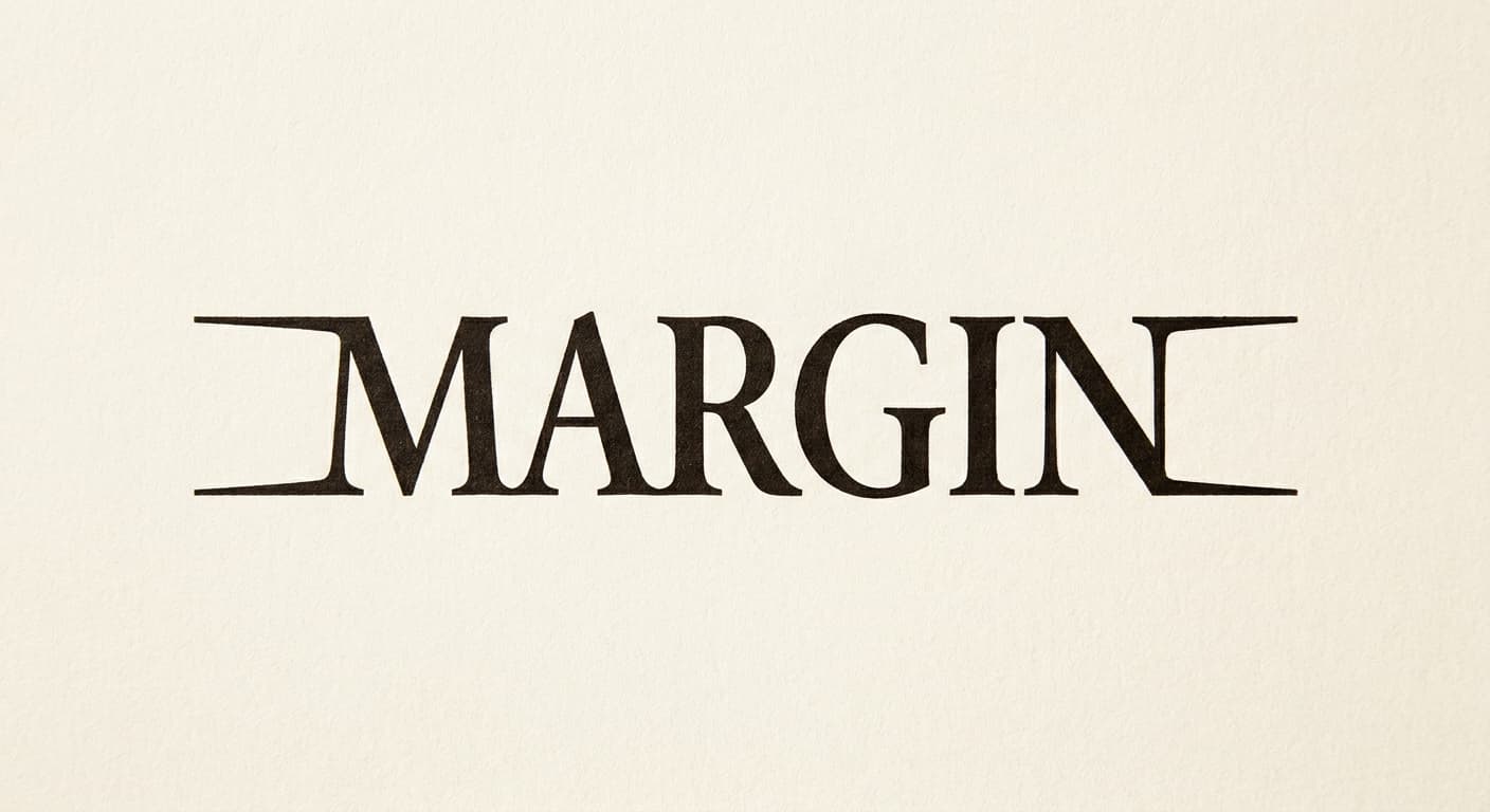
Wordmark in Old-style serif
An old-style serif masthead is the editorial heritage register, calibrated to Caslon and ATF Garamond rather than Bodoni or Didone. The wordmark is set in custom letters with extended serifs on the M and N to give the masthead a horizontal lock-in at cover scale. Reference: The New York Review of Books, Granta archival mastheads, n+1, The Baffler. Single-color reproduction is the load-bearing constraint; every variant must hold at 100 percent black on warm cream.
Reference: The New York Review of Books, Granta archival mastheads, n+1, The Baffler
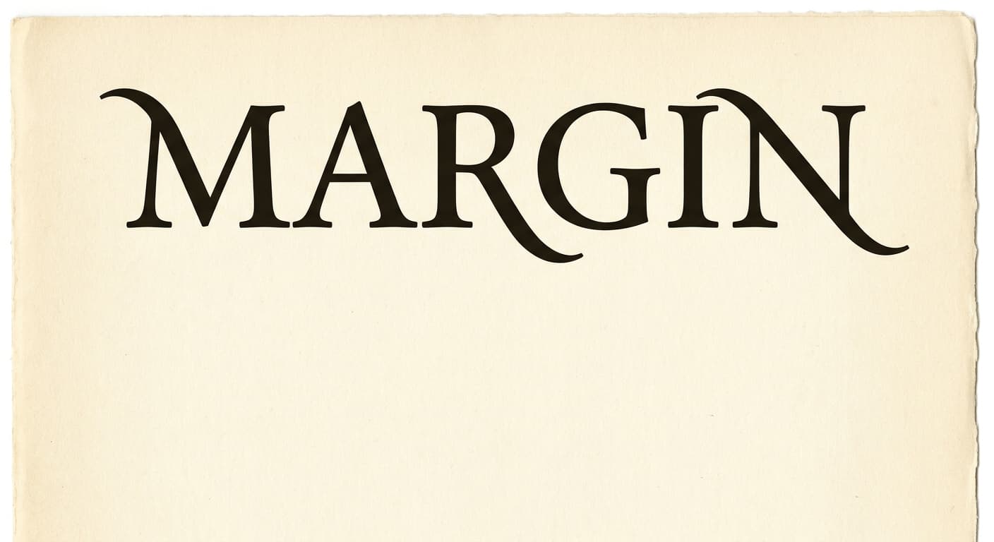
Variant exploration
3 variants across the architectures.
Each variant takes a different position on architecture or register so the brand owner can see the choice clearly. The variants below would constitute the presentation set for review.
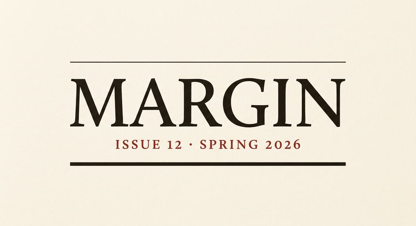
Application contexts
The mark in five application contexts.
A mark that does not survive its application contexts is not a contender. The renders below show the primary variant against each of the five surfaces this brand has to ship on.
Print cover masthead
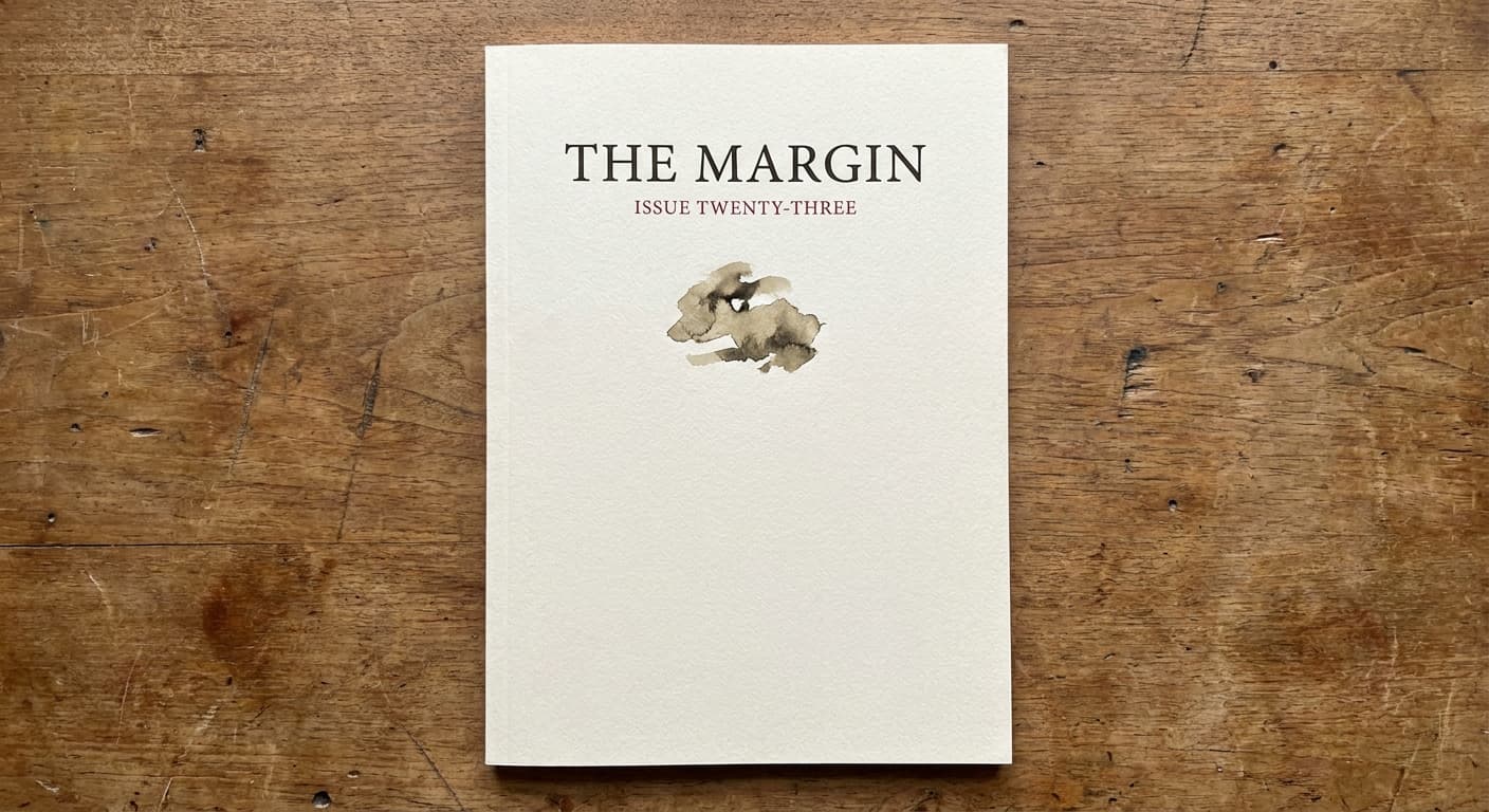
Quarterly journal cover at full size.
Spine print at 9pt
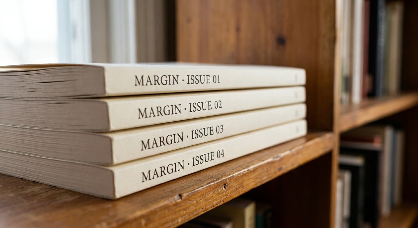
Issue identifier on the bookshelf at typeset scale.
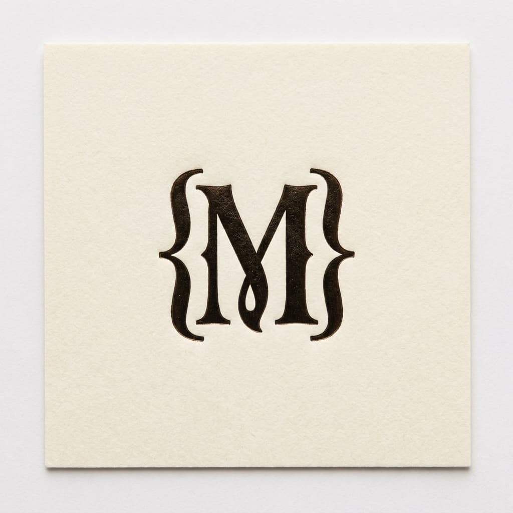
Membership card foil
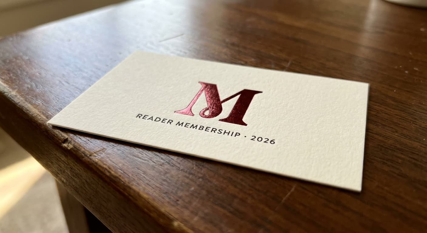
Reader subscription card at quarter-inch foil mark.
Newsletter header
Email template masthead at responsive width.
Favicon · 32px

Browser tab at retina favicon size. Subtle letterform detail can survive here.
The deliverable
One variant, the nine-field spec.
This is the format the logo-design skill produces for every variant in a presentation set. The brand owner reads the spec, the mockup notes, the signals and rejects, and decides on the architecture before the production refinement begins.
Continue